Preview image. Unlock full-res
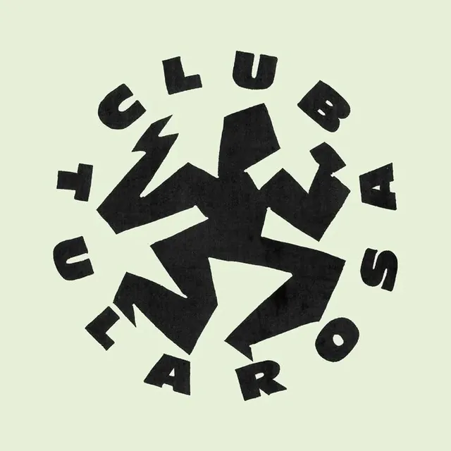
A circular logo formed by arranging fractured display letters around a central abstract mark, rendered in solid black on pale green.
Summary
A circular logo formed by arranging fractured display letters around a central abstract mark, rendered in solid black on pale green.
Visual description
Black geometric mark sits at the center with letter fragments radiating outward: U, L, B, A, S, E, R, O, F, I in broken, angular forms. Letters are heavy-weight display sans-serif, some rotated 45 degrees, creating an informal circular rhythm. The pale green background provides stark contrast and suggests 1970s-80s graphic design influence. Composition feels emblematic and badge-like, balanced by the scattered letter arrangement.
Key takeaway
The fractured, rotated letterforms breaking the grid create visual tension within a simple circular container. The restricted palette (two colors plus background) and bold weight keep it striking and reproducible.
Reuse notes
Best for brands seeking playful, retro-modern logos or badge-like marks. The broken letters work for music, design studios, or creative agencies. Scale the geometry carefully to maintain letter recognizability.