Preview image. Unlock full-res
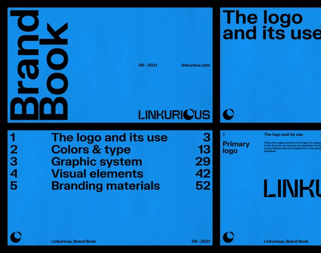
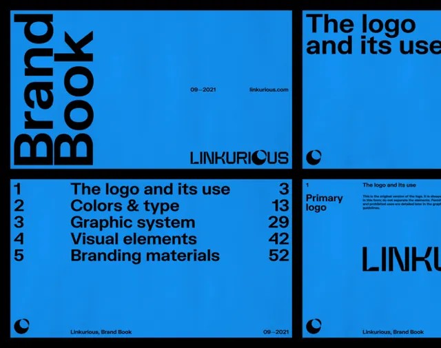
Modular design-system showcase using stark black, bright blue, and white in a grid-based layout with numbered sections and sans-serif typography.
Summary
Modular design-system showcase using stark black, bright blue, and white in a grid-based layout with numbered sections and sans-serif typography.
Visual description
A rectangular composition divided into six distinct grid-based modules, each separated by crisp black borders and light gray dividers. The upper-left quadrant displays a black panel labeled "LINC" (the brand name) in a clean sans-serif. Adjacent panels show "The logo and its use" text and other guideline sections (Colors & type, Graphic system, Logo variations, Branding materials), each numbered (2, 3, 4.5, 5.2). The top-right holds a bright electric-blue background with the wordmark "LINC" displayed. The layout uses high contrast between black text on light backgrounds and light text on the bright blue, with ample geometric spacing emphasizing clarity and authority. The visual language is architectural, grid-strict, and optimized for information hierarchy.
Key takeaway
The strict grid-based modular system for presenting identity guidelines; the strategic use of a single accent color (bright blue) to draw focus and create visual variation; the clean hierarchy achieved through typography scale, weight, and black borders rather than ornament.
Reuse notes
Exemplary for design-system documentation or editorial identity projects needing to present multiple asset categories (logo, type, color, layout rules) in a legible, scannable format. The high contrast and geometric structure work well for digital publishing, design tools, or corporate guidelines. Best suited to professional contexts where authority and clarity are priorities.
More like this




Keep what you find
A free account saves references to boards and can send you a weekly email of picks based on what you save.
To see every result, go Pro.