Preview image. Unlock full-res
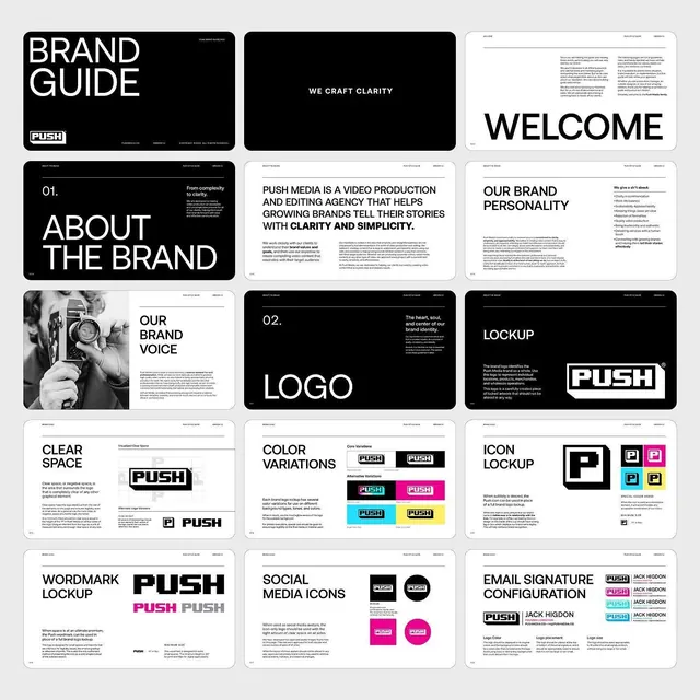
A 15-page brand guideline contact sheet for video agency PUSH, laid out in a strict black-and-white grid with bold Helvetica-style headers and magenta and cyan accents.
Summary
A multi-page brand guidelines deck for a video production and editing agency called PUSH, shown as a 3-column contact sheet of fifteen spreads covering welcome, brand voice, logo lockup, clear space, color variations, wordmark and email signature pages.
Visual description
Fifteen landscape pages are tiled in a clean grid against a light gray backdrop. The system alternates inverted black pages (BRAND GUIDE cover, ABOUT THE BRAND, WE CRAFT CLARITY, LOCKUP) with white text-heavy pages, all set in a tight bold grotesque with oversized all-caps display headers. The PUSH wordmark is an italic-tilted boxed logotype, repeated across lockup, clear-space-with-construction-marks, and icon pages. Color variation and social-icon spreads introduce bright magenta and cyan swatches against the otherwise strict black/white scheme. Body copy sits in small justified columns; every page carries running headers and footers, reinforcing a documentary, systematic feel.
Key takeaway
The cover-to-spec rhythm: open with bold inverted statement pages, then drop into disciplined white reference pages so the loud and quiet pages set each other off. Keep the palette monochrome and let one or two saturated accents appear only on the color and social pages. Construction-mark clear-space diagrams sell the rigor.
Reuse notes
A reusable template for a small studio or agency brand book where typography is the identity. Pairs well with a single bold grotesque and one accent color. Caveat: this density of all-caps display type reads as confident but can feel shouty for softer or consumer brands. </content>
More like this




Keep what you find
A free account saves references to boards and can send you a weekly email of picks based on what you save.
To see every result, go Pro.