Preview image. Unlock full-res
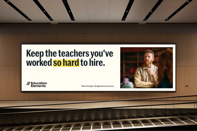
A wide cream billboard in a transit hall pairs a bold two-line headline with a yellow highlighter mark on two words and a photograph locked to the right edge.
More like this
See all


Summary
A landscape billboard mounted on a wood-panelled wall above an escalator, built from one bold headline, a yellow highlight on the two words that carry the argument, and a single supporting photograph.
Visual description
The lit panel is a warm cream rectangle with a thin dark frame, occupying the middle third of the frame. The headline runs two lines left-aligned in a heavy condensed sans, near-black: "Keep the teachers you've worked so hard to hire." The words "so hard" sit inside a rough yellow rectangle, drawn slightly askew and overshooting the letterforms like a marker stroke. Bottom left is the two-line logo lockup in black at small size. Centered along the bottom edge in small regular weight sits the tagline "Real change. Designed around you." The right quarter of the panel is a full-height photograph of a bearded man in a cream shirt gesturing mid-conversation in a library, warm and shallow in focus. Around the panel, dark ceiling baffles with downlights above, a horizontal wood-slat wall behind, and the ribbed metal treads and handrail of an escalator running across the lower third.
Key takeaway
The highlighter mark does the work a second color or a weight change would usually do: it points at the emotional part of the sentence without breaking the single typeface. Reserving the right edge for one photo keeps the copy block uninterrupted, which is what makes a long headline still readable at billboard distance.
Reuse notes
Useful for out-of-home or web hero work where the message is a full sentence rather than a slogan, especially in education, recruiting or public-sector campaigns. The highlight device only survives if it stays on one or two words per layout. The photo needs to be loose on the right side so the subject does not crowd the copy.