Preview image. Unlock full-res
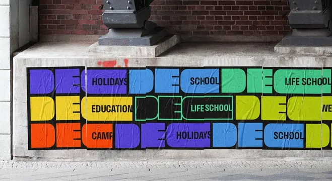
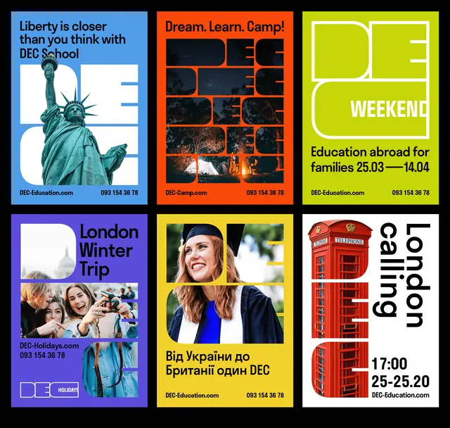
Six-up poster grid for an education brand where the oversized DEC monogram acts as both headline and photo mask across six saturated color fields.
More like this
See all
Summary
Six campaign posters laid out three across on black, each one a single flat color field carrying the same oversized DEC monogram used differently. The system holds together because the letterforms stay identical while the color, the crop and the photo treatment change.
Visual description
Top row: a sky-blue poster with black headline copy reading "Liberty is closer than you think with DEC School", the monogram set huge in white behind a cutout photograph of the Statue of Liberty; an orange poster headed "Dream. Learn. Camp!" where the monogram is repeated four times as a stacked block and filled with night, forest and campfire photography; an acid-yellow-green poster with the monogram drawn in white outline only, "WEEKEND" set inside the counter of the C, and two lines of black date copy below. Bottom row: a violet poster with "London Winter Trip" set in black beside the white monogram, two photographs banded across the lower half and a small boxed DEC HOLIDAYS lockup; a yellow poster with a graduate photograph cropped into the monogram and a Cyrillic line of copy under it; a white poster with a red telephone box standing in for the letterform and "London calling" set rotated ninety degrees down the right side. Every poster closes with a small black footer line pairing a URL with a phone number.
Key takeaway
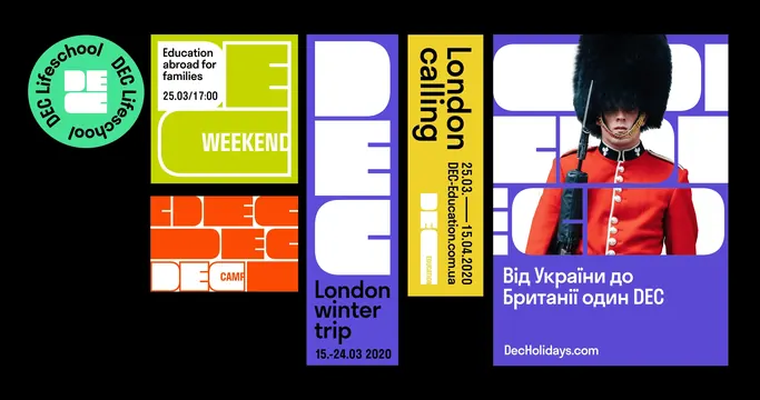
One letterform doing three jobs at once: headline, image window and container for sub-brand words. Locking the type and varying only the fill keeps six very different subjects reading as one campaign.
Reuse notes
A good reference for a sub-branded organization that needs many message variants from a single mark. Depends on a monogram with wide, closed counters big enough to hold a photo or a word; a thin or narrow logotype will not survive this treatment.