Preview image. Unlock full-res
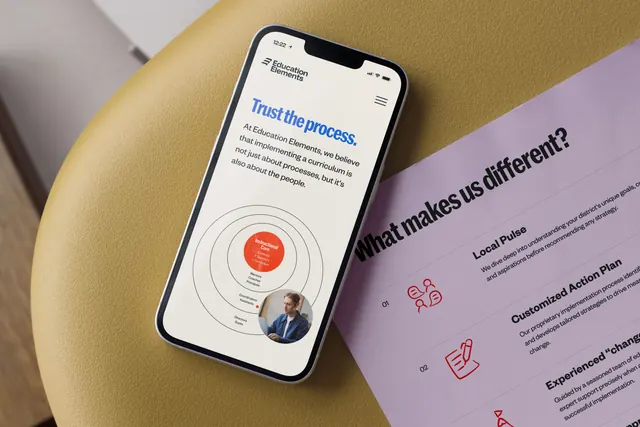
An angled desktop shot pairs a phone showing the brand's mobile site with a lilac printed sheet listing numbered differentiators beside red line icons.
More like this
See all
Summary
One frame showing the identity working across two media at once: a mobile web screen on a phone and a printed lilac leave-behind, both photographed at a shared diagonal.
Visual description
The composition is rotated roughly thirty degrees. Upper left, a white phone rests on a mustard yellow upholstered stool; its screen shows a cream page with the two-line logo lockup top left and a hamburger icon top right. The headline "Trust the process." runs large in blue heavy condensed sans, followed by a paragraph of dark body copy in a lighter weight. Below sits a concentric-ring diagram: four thin black circles around a filled orange red center labelled "Instructional Core", with small labels stepping outward on each ring and a circular photograph of a person at a desk masked into the outermost ring at lower right. To the right, a lilac sheet lies on a darker surface, carrying the question "What makes us different?" in large black condensed sans and a numbered list beneath: "01 Local Pulse", "02 Customized Action Plan", "03 Experienced change" with two lines of grey body copy each and a red outlined icon (speech bubbles with figures, a hand writing on a document) at the left of each entry. The sheet runs off the right edge, so the third entry is cropped.
Key takeaway
The diagram is the interesting move: a plain concentric model becomes brand property by filling the core with the identity orange and masking a real photograph into the outer ring. Alongside it, a numbered list carried by outlined red icons shows the same system in a quieter, print register.
Reuse notes
Useful when a case study or portfolio page has to demonstrate cross-media consistency in a single image, and as a layout reference for consulting-style one-pagers with a framework diagram. The steep angle looks good but makes the right-hand copy hard to read, so it works better as a hero image than as a documentation frame.