Preview image. Unlock full-res
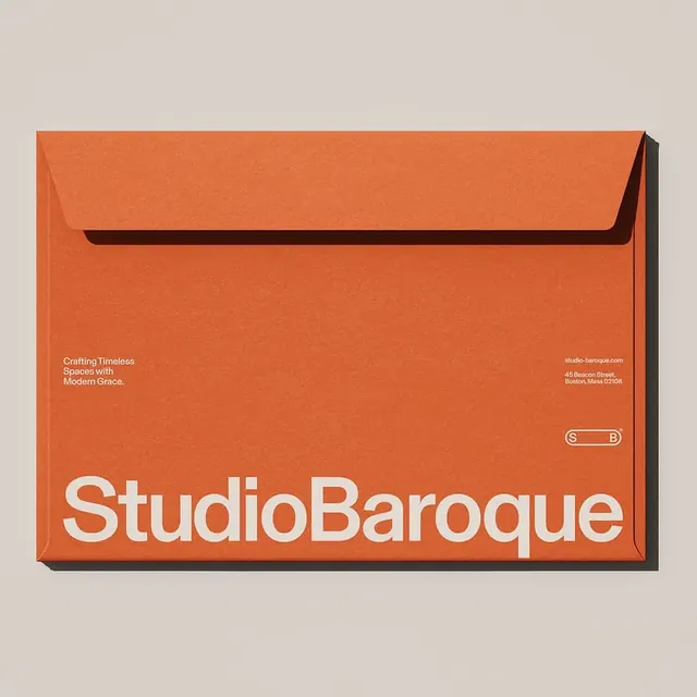
A Helvetica-style stationery mockup where an oversized white wordmark anchors the bottom of a burnt-orange envelope on a warm grey backdrop.
Summary
A photographic stationery mockup for "StudioBaroque," defined by a single oversized Helvetica-style wordmark in white running across the foot of a burnt-orange envelope.
Visual description
A flap-up envelope in saturated terracotta orange sits flat on a soft warm-grey surface, lit to cast a faint shadow at top-right. The lower band carries the brand name set tight and lowercase-capitalized as one word, in a heavy neutral grotesque, hugging the bottom edge. Mid-height, two small white text blocks split left and right: a three-line tagline "Crafting Timeless Spaces with Modern Grace." on the left, and a stacked URL plus a Boston return address on the right. Just above the address sits a rounded pill containing "S" and "B" with a registered-trademark mark, a compact monogram lockup. All type is the same off-white, all set small except the wordmark.
Key takeaway
The hierarchy trick of one enormous wordmark doing all the brand work while everything else stays whisper-small. The pill-enclosed "S B" monogram as a secondary mark that echoes the rounded grotesque. Tagline and address mirrored at equal optical weight across the envelope's centerline.
Reuse notes
A strong template for premium service or interior/real-estate stationery where you want warmth without ornament. The single-color paper plus white ink keeps print cheap; works best when the wordmark is genuinely long enough to span the full width.
More like this


Keep what you find
A free account saves references to boards and can send you a weekly email of picks based on what you save.
To see every result, go Pro.