Preview image. Unlock full-res
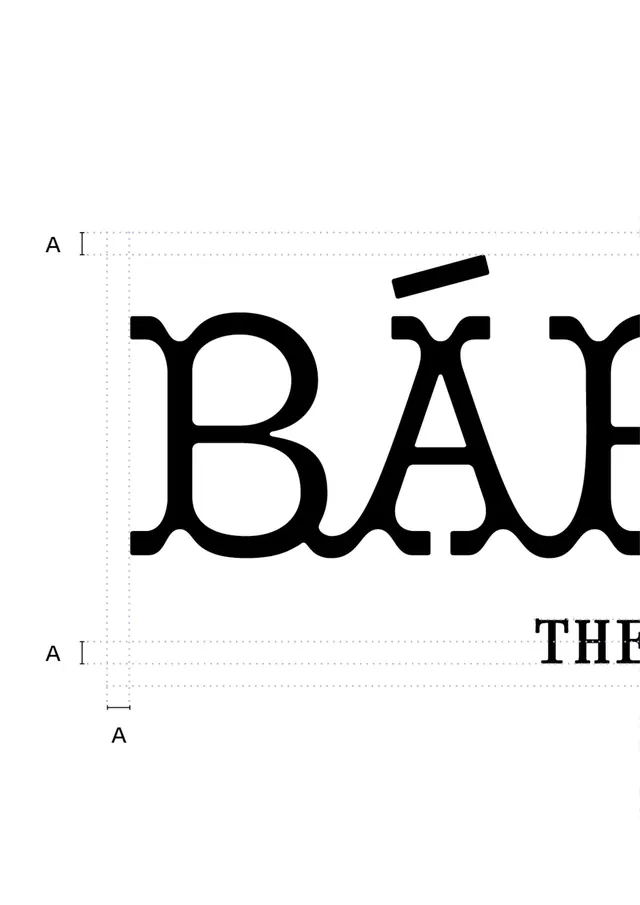
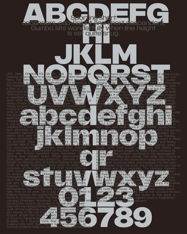
Type specimen page for a bold, high-contrast serif showing large letterforms B and A with construction lines and sizing marks.
Summary
Type specimen page for a bold, high-contrast serif showing large letterforms B and A with construction lines and sizing marks.
Visual description
Large, black serif capital letters B and A dominate a white page with dotted baseline guides, cap-height lines, and dimension marks in gray. The serif letterforms are hefty and ornamental with pronounced serifs and generous interior counters. A scale ruler with "A" markers appears in the lower left. The letterform construction is fully exposed through visible guides, rendering this as a reference document for typographers or designers studying the font's proportions and metrics rather than a finished typographic composition.
Key takeaway
The heavy serif construction with clear geometric bone structure provides a strong baseline for display typography. Showing the guide grid alongside the letterforms helps designers understand proportion ratios and spacing logic. This documentary approach to type presentation has contemporary appeal for editorial and luxury brands seeking authoritative design language.
Reuse notes
Reference for building a custom serif typeface system or for understanding classical type construction principles. Works in premium design contexts (editorial, luxury goods, legal/financial services) where formality and tradition signal trustworthiness. The construction-grid aesthetic is particularly useful when the design itself should feel systematic and deliberate.
More like this






Keep what you find
A free account saves references to boards and can send you a weekly email of picks based on what you save.
To see every result, go Pro.