Preview image. Unlock full-res
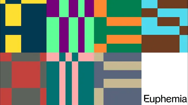
A full-bleed mosaic of flat color blocks in an irregular modular grid, with the Euphemia wordmark sitting in a white block at the lower right.
More like this
See all

Summary
The brand's graphic language shown raw: a wall of flat rectangular color blocks locked to a modular grid, broken only by a white cell holding the wordmark.
Visual description
The frame is filled edge to edge with rectangles of solid color and no gradients, outlines or shadows. The grid is modular but irregular: columns of different widths carry blocks of different heights, and some cells run as thin vertical stripes while others sit as large fields. The upper band is high key, yellow against deep navy, purple alternating with mint, orange over forest green, cyan interlocking with chocolate brown. The lower band shifts cooler and dustier, brick red with olive grey, teal with pale pink stripes, sand and slate blue. A pure white block occupies the bottom right corner and carries the wordmark "Euphemia" in a plain grotesque sans, cropped by the frame edge so the final letters run out of view. Every color meets its neighbor on a hard edge with no gutter, and the composition is cropped so no block resolves as a complete outer border.
Key takeaway
A palette this wide stays coherent because the system enforces one rule: flat fills, hard edges, one modular grid. Reserving a single white cell for the wordmark gives the mark a permanent home without adding a container or a rule.
Reuse notes
Good starting point for a brand that needs an owned pattern rather than a logo mark to do the recognition work, and it scales from a favicon crop to a building wrap. It demands strict discipline elsewhere, since almost any photography or extra type will fight it. Pairs with plain black on white typography.