Preview image. Unlock full-res
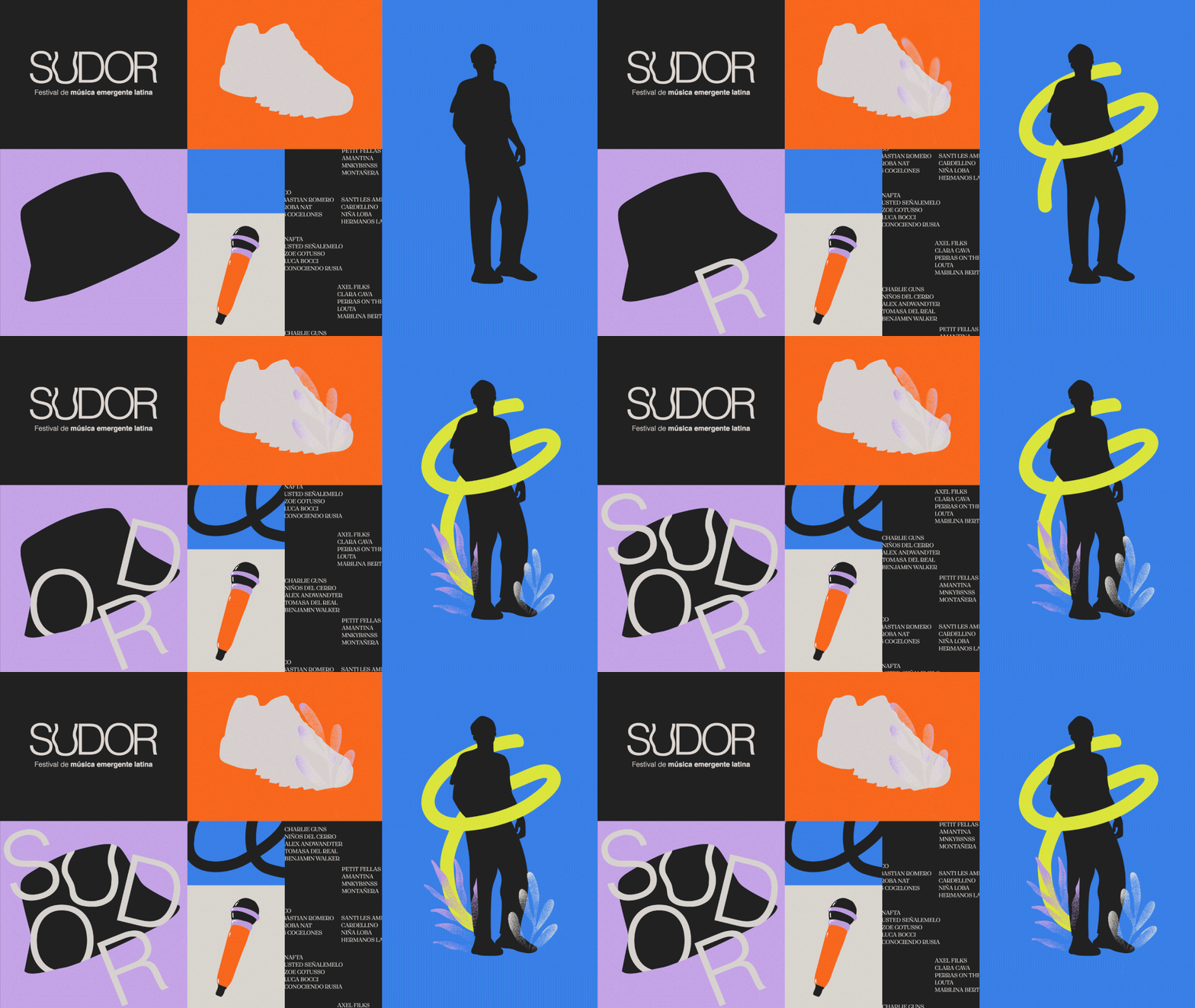
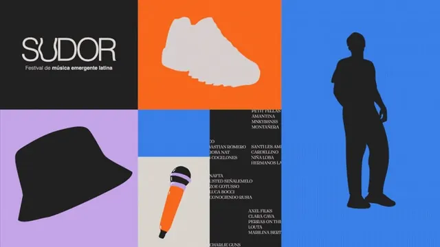
A vibrant promotional grid for SUDOR, a Latin music festival, combining the event wordmark with illustrated product elements and an artist lineup across multi-colored sections.
Summary
A festival promotional poster for SUDOR ("Festival de música emergente latina") using a grid-based layout that combines the event wordmark with illustrated product elements—a sneaker, bucket hat, microphone, and silhouette figures—alongside artist names in high-contrast colored sections.
Visual description
A nine-section grid divided by bold color blocks: dark charcoal, vibrant orange, bright blue, lavender purple, and cream. The top-left dark section features the "SUDOR" wordmark in white with subtitle "Festival de música emergente latina" beneath. Remaining sections feature stylized product illustrations: a white sneaker silhouette on orange, a black bucket hat on lavender, an orange microphone with black details on cream, and black standing silhouettes on blue. A black text panel lists artist names in white serif type. The palette is intentionally bold and high-contrast, with each color field creating visual separation while maintaining compositional unity through the grid structure. Typography is assertive and hierarchical, supporting the wordmark and guiding the eye through the lineup.
Key takeaway
Mixing illustrated product elements with type creates a memorable, approachable event identity that feels both contemporary and playful. The grid structure organizes diverse content (logo, products, artists) into a cohesive system that works as both poster and modular promotional component. Color blocks serve as both aesthetic choice and organizational tool, allowing distinct content zones without visual confusion.
Reuse notes
Effective for music festival, cultural event, or product launch promotions that need bold visual impact and personality. The mix of illustration and typography keeps the design approachable while the high-contrast palette ensures legibility in print and digital contexts. The modular grid adapts well to various formats—posters, digital tiles, social media cards. Works especially well when targeting creative or entertainment audiences. The illustrated product approach is reusable across seasonal campaigns or different artist lineups.
More like this

Keep what you find
A free account saves references to boards and can send you a weekly email of picks based on what you save.
To see every result, go Pro.