Preview image. Unlock full-res
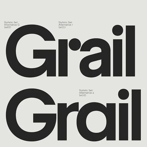
Typographic reference showing two letterform variations of the word 'Grail' in bold, geometric sans-serif with labeled stylistic alternates.
Summary
Two size-matched typographic variations of "Grail" in a bold geometric sans-serif, systematically labeled to show font alternates (stylistic set variations) against a neutral beige canvas.
Visual description
Centered composition on a light beige background. Two large-scale type specimens stacked vertically, each setting the full word "Grail" in bold geometric sans-serif with thick, uniform stroke weight and distinctive circular-bulb terminals on letterforms like "i" and accent marks. Small callout labels above each specimen name the stylistic set variant (e.g. "Stylistic Set: Alternative G (U+0452)"). The geometric character forms are precise and highly regular, with the "G" featuring a bold rounded stroke structure. No extraneous imagery, pure systematic font documentation.
Key takeaway
The clean, scannable methodology of presenting type variations side-by-side with labeled alternates; the discipline of letting geometric letterforms carry visual weight without decoration; circular terminal details that add personality while maintaining modernist restraint.
Reuse notes
Strong reference for designing geometric sans-serif families or documentation of type systems. The neutral palette and systematic layout work for design-system specifications, specimen sheets, or technical branding collateral. Best for contemporary, professional, or design-focused brands.
More like this







Keep what you find
A free account saves references to boards and can send you a weekly email of picks based on what you save.
To see every result, go Pro.