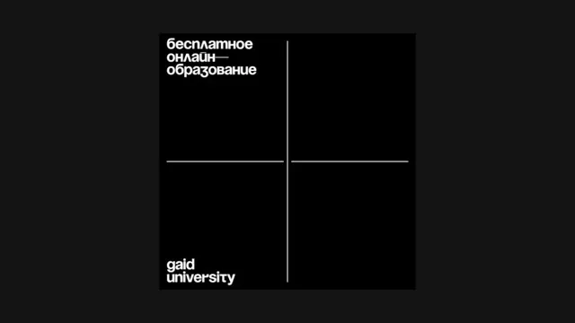
Preview image. Unlock full-res
A minimalist institutional identity using a centered four-quadrant grid with clean sans-serif typography and Russian language text.
Summary
An institutional identity system built on a strict centered four-quadrant grid with white lines dividing a dark field, featuring institution name and text in clean sans-serif.
Visual description
Nearly black background (very dark charcoal) with a centered square containing four equal quadrants divided by white lines forming a plus sign. In the upper left quadrant, white sans-serif text reads "бесплатное онлайн образование" (free online education in Russian). In the lower left quadrant, white sans-serif text reads "gaud university". The lines are ruled with geometric precision, and there is minimal typographic treatment beyond clean, justified alignment. The composition is spare and austere, with the grid serving as the primary visual organizing principle.
Key takeaway
The grid as institutional symbol: white lines on dark create clarity and formality suitable for educational and corporate contexts. Two-tier typographic hierarchy (Russian descriptor, wordmark) operates within disciplined geometry. The centered approach and negative space create authority without decorative excess. This grid pattern could serve as a repeatable system element across applications.
Reuse notes
Ideal for educational institutions, corporate identity systems, or organizations needing formal gravitas. The monochromatic approach works across print, digital, and signage without color management concerns. The grid provides flexibility for adding content or additional organizational units in future applications. Less suited to casual or playful brand contexts.
More like this





Keep what you find
A free account saves references to boards and can send you a weekly email of picks based on what you save.
To see every result, go Pro.