Preview image. Unlock full-res
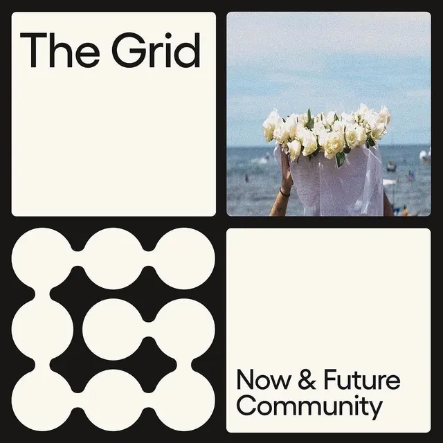
A four-panel brand identity showcasing 'The Grid' and 'Now & Future Community' with a title panel, photography, abstract geometric pattern, and text-only section against dark and light contrast.
Summary
A four-panel brand identity showcasing "The Grid" and "Now & Future Community" with a title panel, photography, abstract geometric pattern, and text-only section against dark and light contrast.
Visual description
A bold four-quadrant composition set against a dark background. Top left: cream panel with "The Grid" in large, heavy black sans-serif type (left-aligned, no serifs). Top right: outdoor photography of white flowers being held up to a blue sky and ocean backdrop, soft focus, warm and inviting. Bottom left: an abstract geometric pattern of white circles arranged in interlocking waves against black, creating a rhythm of positive and negative space. Bottom right: cream panel with "Now & Future Community" in the same heavy black sans-serif, left-aligned. All panels have rounded corner frames.
Key takeaway
The four-panel grid as a cohesive identity system; using abstract geometry (the wave pattern) as a core visual asset; the contrast between type-only panels, photography, and geometric pattern to create visual variety within unity; the pairing of cream/light backgrounds with black type for maximum legibility; the emotional balance between the calm photography and the structured geometric mark.
Reuse notes
Ideal for nonprofits and community brands seeking calm, purposeful, and inclusive visual language. The soft photography communicates humanity and hope. The geometric pattern is distinctive and reproducible across touchpoints. Works as a system that can be applied to signage, publications, and digital. Best in the cream and black palette shown.
More like this






Keep what you find
A free account saves references to boards and can send you a weekly email of picks based on what you save.
To see every result, go Pro.