Preview image. Unlock full-res
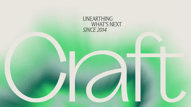
Large wordmark (Qiatt) with light stroke over organic green-to-teal gradient, accompanied by positioning tagline in serif and sans-serif mix.
Summary
A light-stroked wordmark set against an organic green-to-teal gradient backdrop, paired with a positioning tagline in serif and sans-serif, communicating natural and future-forward identity.
Visual description
The composition centers on a large wordmark in light cream or off-white stroke (no fill) on a soft, organic gradient background that transitions from pale mint-green at the top, through mid-teal in the middle, and deepens to forest green at the bottom. Above the wordmark in smaller type sits the positioning line "UNEARTHING WHAT'S NEXT SINCE 2014" in a mixed serif-and-sans treatment (upper line in clean sans, the phrase "SINCE 2014" in lighter serif). The gradient has soft, almost watercolor-like edges with slight blur and depth, reinforcing organic authenticity. The mark itself is spacious and centered, letting the gradient be a full design partner rather than passive backdrop.
Key takeaway
The outline-only wordmark technique that gains dimensionality from the gradient backdrop rather than inherent weight, the organic gradient that suggests nature without being literal, and the paired positioning line that layers brand history and forward vision in mixed typography.
Reuse notes
Effective for sustainability, wellness, or natural-goods brands seeking modern sophistication over rusticity. The light stroke and gradient depth avoid cliches and work at large scales (packaging, signage, web hero). The mixing of serif positioning copy with sans-serif mark creates visual and conceptual tension worth stealing. Pairs well with clean, negative-space layouts and photography.