Preview image. Unlock full-res
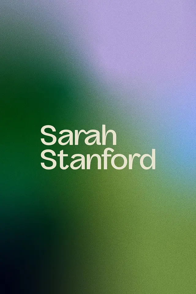
A vertical name mark using a soft gradient backdrop that transitions from deep teal-green through purple-lavender, emphasizing calm, organic elegance.
Summary
A personal mark for Sarah Stanford, composed of stacked sans-serif type over a full-bleed vertical gradient that shifts from deep forest teal at the lower left through warm olive-yellow in the center to cool blue-lavender at the upper right.
Visual description
The composition is a vertical portrait rectangle (roughly phone-proportioned) with a smooth radial gradient filling the entire background. The gradient begins at deep forest green (almost teal) in the lower-left quadrant, transitions through warm golden-olive in the center, and concludes with cool blue-lavender in the upper-right corner. The name "Sarah Stanford" is set in white, high-contrast sans-serif type, stacked two lines (first name and last name), positioned slightly off-center within the upper half of the canvas. The type is spacious and clean, employing leading and letter-spacing that feel elegant and open. No additional ornament or imagery; the gradient alone provides visual interest and depth.
Key takeaway
The soft multi-hue gradient (cool-to-warm-to-cool) creates atmospheric depth without illustration or pattern. The monochromatic white type against the gradient ensures maximum legibility and creates a timeless, portfolio-ready aesthetic. A simple centered composition scaled across one key view maximizes the mark's adaptability.
Reuse notes
Strong for minimalist personal or freelance branding, especially portfolios, agencies, and creative professionals. The gradient approach works well for digital-first presentation (websites, social profiles). The portrait orientation limits icon/favicon use; rotate or crop for square applications. Needs sufficient contrast in resizing; test at favicon scale.