Preview image. Unlock full-res
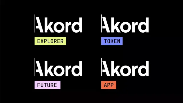
A minimalist type system displaying the Akord wordmark repeated four times in a 2x2 grid, each paired with a distinct colored tag identifying a product variant or feature.
Summary
A product naming system showing the master wordmark Akord repeated four times, each followed by a colored rectangular tag labeling a distinct offering or feature tier: Explorer (lime), Token (lavender), Future (pink), and App (coral).
Visual description
Against a solid black background, four instances of the Akord wordmark are arranged in a 2x2 grid, rendered in a clean, geometric sans-serif in white. Each wordmark is paired with a small rectangular label positioned directly below it. The labels use contrasting pastel hues: lime-green with black caps for EXPLORER (top left), lavender-blue with black caps for TOKEN (top right), pale pink with black caps for FUTURE (bottom left), and coral-orange with black caps for APP (bottom right). The type is bold and sans-serif throughout, sized consistently. The geometric clarity and limited color palette create a structured, modular appearance.
Key takeaway
The color-coding system offers instant visual differentiation without adding visual weight; each tier is unmistakable at a glance. The rectangular labels act as functional badges rather than decorative elements, establishing a repeatable system. The bold sans-serif paired with the black ground creates authority and clarity, essential for communicating multiple product offerings.
Reuse notes
A strong template for SaaS or fintech products offering multiple tiers or features under one brand. The strict grid and color system make this scalable to additional product lines. Works particularly well for financial products, development tools, or subscription models where clear tier differentiation is a selling point. The pastel-colored tags prevent the design from feeling cold despite the black background.
More like this








Keep what you find
A free account saves references to boards and can send you a weekly email of picks based on what you save.
To see every result, go Pro.