Preview image. Unlock full-res
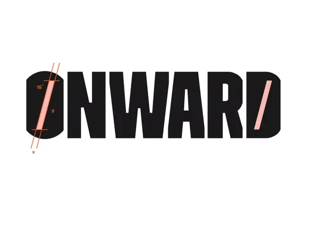
An all-caps logotype 'ONWARD' in heavy sans-serif with a geometric circle mark and intersecting measurement lines in coral-orange accent color on light background.
Summary
An all-caps logotype 'ONWARD' in heavy sans-serif with a geometric circle mark and intersecting measurement lines in coral-orange accent color on light background.
Visual description
Horizontal composition with the word 'ONWARD' set in a bold, condensed geometric sans-serif at large scale in solid black. At the left edge, a geometric circle (O shape) connects the 'O' letterform, rendered in black filled bulk. Overlaid across this circular element are angled coral-orange measurement lines with small labels (showing angles like 15 degrees, marked with x and y coordinates), suggesting an engineering drawing or technical annotation. These lines cross diagonally, implying precision, angle measurement, and technical rigor. The light cream-beige background provides neutral contrast and creates a sense of technical documentation or blueprint aesthetic.
Key takeaway
The annotation layer (measurement lines with degrees and coordinates) elevates a simple logotype into a design system artifact. This technique signals technical expertise, precision, and engineering sensibility without adding visual clutter. The warm orange accent acts as a secondary brand color that stands apart from the black and background, creating memorable tertiary depth. The strategy pairs well with brands in technology, hardware, or precision-focused industries.
Reuse notes
Effective for tech, engineering, manufacturing, or data-driven brands needing to convey precision and rigor. The measurement-line treatment works especially well when the brand story involves building, iteration, or technical excellence. Keep the accent color warm and saturated to maintain visibility; this layout scales well from large application to favicon-sized marks.