Preview image. Unlock full-res
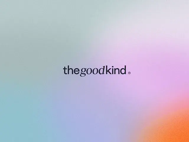
Minimal wordmark logo set against a soft gradient transitioning from cool teal through lavender and pink to warm peach.
Summary
Minimal wordmark logo set against a soft gradient transitioning from cool teal through lavender and pink to warm peach.
Visual description
The logo features a lowercase sans-serif wordmark "thegoodkind" with a small registered trademark symbol, displayed in dark gray-black. The letterforms are tight and unified, with even stroke weight and no serifs. The background is a smooth, directional gradient flowing diagonally from pale teal at the top-left through lavender in the upper-right, shifting to pink and peach tones in the lower portion. The gradient creates a soft, dreamy atmosphere while maintaining enough contrast for the dark wordmark to read clearly.
Key takeaway
A multi-directional gradient that moves smoothly across three warm and cool tonal zones, creating visual depth without saturation. The placement of a minimal wordmark over a gradient background that draws the eye to the mark without competing for attention. The overall softness achieved through pastel saturation rather than adding blur or effects.
Reuse notes
Effective for lifestyle, beauty, wellness, or consumer brands seeking a contemporary, approachable aesthetic. The gradient works best when the wordmark is strong enough to contrast (dark mark over light-to-medium background). Works particularly well for digital-first brands and social-media contexts. The soft palette reads as friendly and premium simultaneously without appearing corporate.