Preview image. Unlock full-res
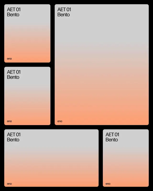
A warm-toned card identity system using soft peachy gradients, rounded corners, and minimal sans-serif labeling for brand or product family presentation.
Summary
A warm gradient card system presenting product or category identities with soft peach-to-tan fades, rounded corners, and right-aligned lowercase labels in a calm, modern aesthetic.
Visual description
Five rounded rectangular cards arranged in a grid layout on a black background. Each card features a gradient background transitioning from light gray at the top to soft peachy-orange at the bottom, with a label identifying "AET 01 Bento" in clean sans-serif type at the top-left and a single word ("ena") positioned in the bottom-right corner in a smaller, softer weight. The cards vary in size, with the largest card taking up roughly the right half of the composition. The gradients are subtle and consistent across all cards, creating a unified visual system that feels both premium and approachable.
Key takeaway
The asymmetric size variation within a unified card grid that avoids rigid uniformity, the directional gradient from cool-to-warm that adds visual interest without saturation, and the restrained typography positioning (label top, identifier bottom) that lets the gradient be the primary design element.
Reuse notes
Ideal for product collections, design system cards, or brand family presentations where you need hierarchy without visual noise. The gradient direction and soft palette work well in premium, lifestyle, or wellness contexts. Cards are sized to fit flexible layouts; scale or aspect-ratio is easily adjustable.
More like this




Keep what you find
A free account saves references to boards and can send you a weekly email of picks based on what you save.
To see every result, go Pro.