Preview image. Unlock full-res
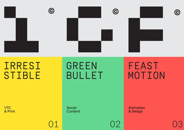
A branded system featuring three geometric logomarks above a three-column grid with vibrant yellow, teal, and coral sections, each labeled with category names and descriptors.
Summary
A branded system with three distinct geometric marks above a grid dividing content into yellow, teal, and coral thirds, each with a category title and descriptor in monospace type.
Visual description
Light gray background. Upper section: three logomarks in black, each composed of overlapping rectangles in unique configurations, separated by centered copyright symbols. Lower section: three full-width colored blocks (yellow left, teal center, coral right) with monospace titles in dark gray (IRRESISTIBLE, GREEN BULLET, FEAST MOTION) and subtitles (VTC & Print, Social Content, Animation & Design). Numbered 01, 02, 03 in monospace at bottom of each section. High contrast between dark shapes and light background, then inverted by saturated color fields.
Key takeaway
The combination of monochromatic geometric marks with a saturated tricolor grid creates immediate visual hierarchy and content organization. Monospace type on the colored fields adds technical sharpness without reducing approachability. Numbered sections make the system feel modular and extensible.
Reuse notes
Strong for service catalogs, portfolio category systems, and agency capability statements. The high saturation and geometric marks work best for forward-thinking, confident brands. Consider whether three categories truly serve your content; the system may feel forced if extended to 4+ sections.
More like this





Keep what you find
A free account saves references to boards and can send you a weekly email of picks based on what you save.
To see every result, go Pro.