Preview image. Unlock full-res
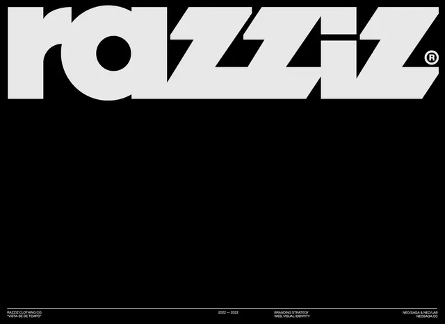
Bold brutalist wordmark for Razziz apparel brand, set in high-contrast black and white with angular geometric letterforms.
Summary
A brutalist wordmark for Razziz apparel rendered in stark monochrome with geometric, angular letterforms cut through with bold black shapes and negative space.
Visual description
The word "RAZZIZ" dominates in a heavy, condensed sans-serif face with jagged, fractured geometry. Angled black bands cut through and interrupt the letterforms, creating visual tension. A small registered trademark symbol appears at the end. Below, small footer text indicates branding strategy and date range. The composition is pure black and white with strong contrast and no gradients or flourishes.
Key takeaway
Brutalist typography that uses geometric disruption and negative space to create energy; the angular cuts transform a straightforward wordmark into a dynamic statement piece.
Reuse notes
Reference for bold apparel and streetwear branding, brutalist design in commercial contexts, and how geometric disruption can elevate a simple logotype into a distinctive visual identity.