Preview image. Unlock full-res
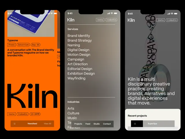
A design studio identity (Kiln) presented across three formats: a bold orange poster, and two dark-mode digital screens showing brand strategy and manifesto content.
Summary
A design studio identity (Kiln) presented across three formats: a bold orange poster, and two dark-mode digital screens showing brand strategy and manifesto content.
Visual description
Left panel: a warm-orange vertical poster card with "Kiln" in large black sans-serif, a small compass or directional graphic, and a blurred stacked-text area (unintelligible at this scale). Center and right panels: dark backgrounds (near-black) showing nested text menus and content panels. Center screen lists categories like "Services", "Brand Identity", "Naming", "Identity Design", "Motion Design", "Illustration", "Editorial Design", "Exhibition Design", and "Wayfinding". Right screen displays the studio's manifesto in white sans-serif above a horizontal navigation bar. A geometric line-art illustration occupies the top right of the right panel. The color palette is monochromatic (black, white, gray) with warm orange as a single unifying accent.
Key takeaway
The consistent personality across media: the same sans-serif and orange accent appear on the poster and in the UI, creating instant recognition. The dark-mode interface is legible and premium-feeling without being cold. Sidebar navigation with clear content categories signals organized, methodical thinking. The single warm accent color prevents dark mode from feeling austere.
Reuse notes
Strong template for creative agencies, design studios, or motion-focused portfolios. The dark mode suits screen-based work and works well for attracting design-literate audiences. The orange accent is confident without overwhelming; use it on CTAs, highlights, and key brand moments. Reserve for brands confident enough to own sophisticated visual language.
More like this





Keep what you find
A free account saves references to boards and can send you a weekly email of picks based on what you save.
To see every result, go Pro.