Preview image. Unlock full-res
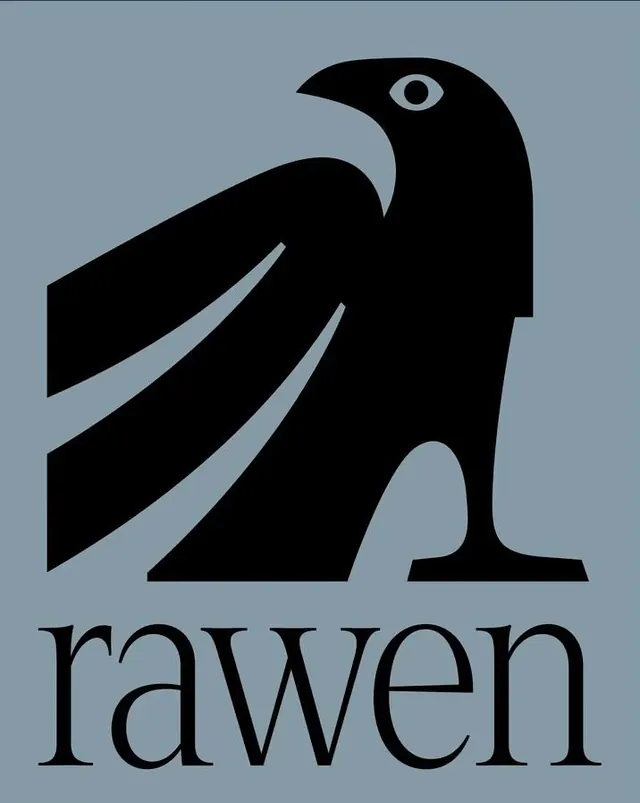
A geometric wordmark pairing a stylized black raven with raised, open wings against a soft slate-blue background, with the brand name in clean serif type below.
Summary
A geometric wordmark combining a stylized raven with spread wings rendered in bold, black shapes against soft slate-blue, with the brand name "raven" set below in elegant, lowercase serif type.
Visual description
The logo is centered on a muted slate-blue field. A black raven fills the upper two-thirds: angular, abstract wing forms create negative space and a sense of upward motion, while a simplified head profile points left with a single light-blue eye detail echoing the background. The bird is constructed from clean geometric shapes with sharp angles and smooth curves, feeling both contemporary and timeless. Below, the word "raven" is set in a refined serif typeface, light weight, with generous letter spacing and lowercase presentation. The serif style adds sophistication while the word itself acts as a grounding anchor beneath the dynamic bird form.
Key takeaway
Geometric simplification that preserves recognizable form and symbolic meaning. The restrained color palette (muted background and pure black) lets the form read clearly without distraction. The single accent color (the eye) provides a focal point without overwhelming the design.
Reuse notes
Well-suited to media, publishing, or technology brands where symbolic strength and understated elegance are valued. The serif wordmark gives it a literary or editorial edge. Works at any scale due to geometric clarity. The slate-blue background is specific; on white the logo would read differently. Avoid for casual consumer brands or playful contexts.