Preview image. Unlock full-res
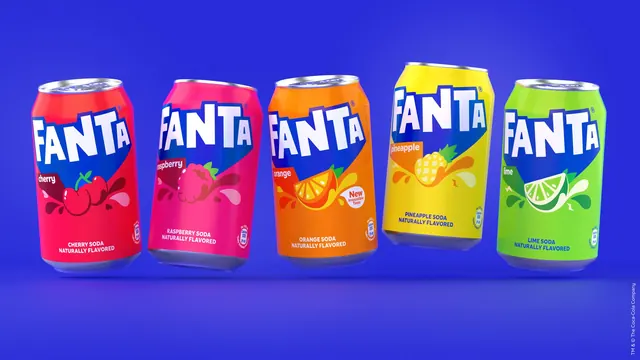
Five Fanta cans floating in a row against blue, each tilted at a different angle to show the flavour colourways side by side.
More like this
See all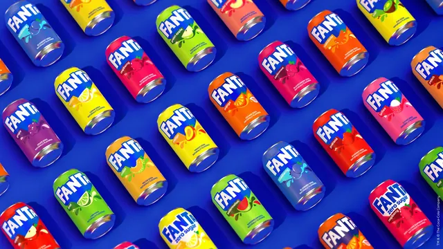
Summary
A classic five-across packshot lineup where each can is tipped at a slightly different angle so the row reads as movement rather than a shelf.
Visual description
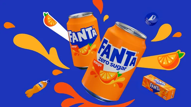
A vivid blue background with a subtle darker vignette holds five cans at roughly equal spacing, each floating just above a soft contact shadow. From left to right they are cherry red, raspberry pink, orange, pineapple yellow and lime green, and each leans a few degrees in a different direction. Every can repeats the same layout: the white FANTA wordmark in heavy faceted capitals inside a blue shape that fills the upper half and points down at the centre, a small white or dark lozenge naming the flavour, a flat fruit illustration with looping liquid splash shapes, and two lines of dark blue all-caps type at the bottom reading the flavour and NATURALLY FLAVORED. The orange can adds a small round white flash reading New Irresistible Taste, and each can carries a small circular nutrition badge. A thin line of legal type runs vertically down each side of the frame.
Key takeaway
Varying the tilt of otherwise identical packshots is a cheap way to make a lineup feel kinetic while keeping every face fully legible. The blue wordmark panel is what holds the row together once the base colours diverge.
Reuse notes
The default hero image for a range launch, a listing sell-in or a case-study opener. Works best with four to six SKUs; beyond that the tilts start to read as sloppy rather than lively.