Preview image. Unlock full-res
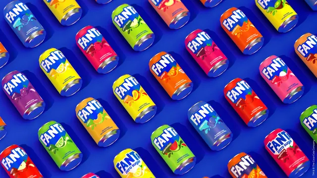
Dozens of Fanta cans in every flavour colourway, rendered in a tilted repeating grid on a deep blue field.
More like this
See all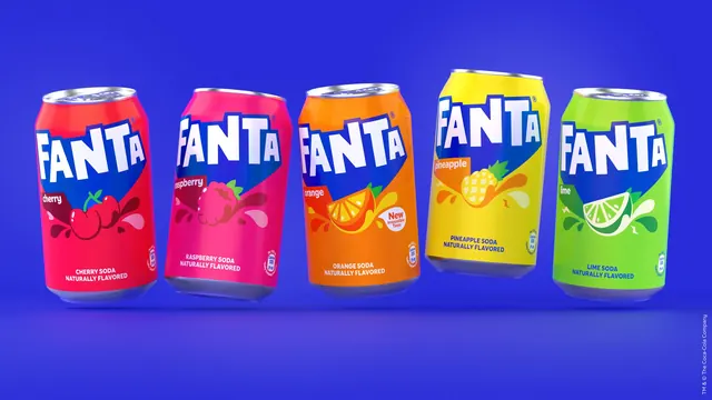
Summary
A full-bleed grid of Fanta cans laid on their sides in staggered diagonal rows, one flavour colourway per can, showing the whole range as a single pattern.
Visual description
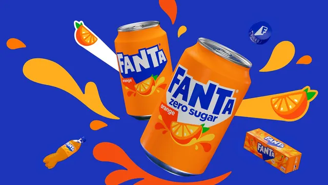
A deep blue background carries five staggered rows of aluminium cans lying on their sides, all rotated to the same angle so the grid runs diagonally and the cans bleed off every edge. Each can is a different flat colour: blueberry pale blue, lemon yellow, raspberry and blackcurrant pinks, green apple and lime and watermelon greens, grape purple, mandarin and orange and guarana oranges and reds, lychee pink, peach and kiwi. Every can repeats the same architecture, the white FANTA wordmark inside a blue shape across the top third, a small lozenge naming the flavour, a simplified fruit illustration with liquid splash shapes below, and two lines of small white type reading the flavour and NATURALLY FLAVORED. Two zero sugar variants sit in the lower rows with a white band behind the flavour name. Soft dark blue shadows fall behind each can and metallic ends catch a highlight. A small line of legal type runs vertically down the right edge.
Key takeaway
Holding the wordmark, splash and type positions absolutely fixed lets the flavour colour do all the differentiating, so twenty cans still read as one brand. Tilting the whole grid off the horizontal turns a range shot into a pattern.
Reuse notes
The clearest way to present a large SKU family in a case study or a trade deck without a lineup of front-facing packshots. Needs a background colour that does not appear on any of the packs; here the deep blue keeps every colourway separate.