Preview image. Unlock full-res
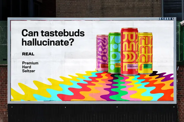
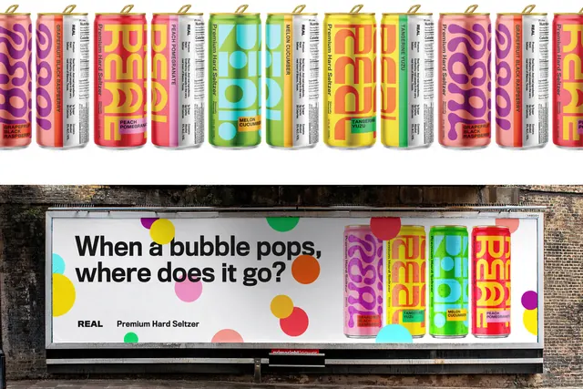
Composite frame with a full-width repeating lineup of seltzer cans above a billboard headline scattered with confetti dots.
More like this
See all
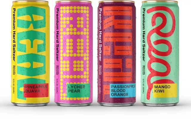
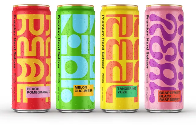
Summary
Two stacked frames: a repeating shoulder-to-shoulder run of seltzer cans across the top, and below it a wide billboard where the same cans sit inside a scatter of flat colored dots.
Visual description
The upper band is a cutout row of cans on white, gold pull-tabs aligned, marching past both edges so the sequence reads as a repeating pattern rather than a group shot. Each can pairs a graphic front (oversized cropped REAL letterforms, or the pink can's purple bubble squiggles) with a white nutrition panel showing a Facts table, ingredients and 5% ALC/VOL, and a vertical flavour name in caps down the seam: GRAPEFRUIT BLACK RASPBERRY, PEACH POMEGRANATE, MELON CUCUMBER, TANGERINE YUZU. A colored chip at the base repeats the flavour in black caps.
The lower half is a photographed billboard on a brick railway arch, its white sheet printed with "When a bubble pops, where does it go?" in two lines of heavy black sans on the left and the REAL wordmark plus "Premium Hard Seltzer" beneath. Flat circles in yellow, cyan, magenta, red, orange and green are strewn across the sheet at varying sizes, some overlapping the four cans grouped on the right, some bleeding off the top and bottom edges. Sunlight falls across the lower brick and pavement.
Key takeaway
Splitting each can into a loud graphic face and a plain white information face lets the range look chaotic on shelf and legible in the hand. On the billboard, flat dots at three sizes are enough to turn a plain white sheet into carbonation.
Reuse notes
Useful when a drinks range needs one system across many SKUs and a poster campaign has to feel like an extension of the pack rather than an ad about it. The repeated-row treatment only works with a can face that is graphic enough to tile. The dot scatter needs generous white space to stay playful instead of busy.