Preview image. Unlock full-res
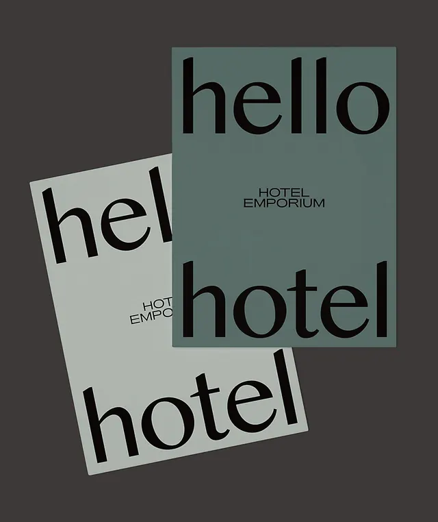
A minimalist hospitality branding system using rotated overlapping cards in sage green and off-white with large, understated sans-serif typography.
Summary
A minimalist hospitality branding system using rotated overlapping cards in sage green and off-white with large, understated sans-serif typography.
Visual description
Three rotated rectangular cards arranged asymmetrically against a dark charcoal background. Top-right card is sage green with "hello" in large black sans-serif lowercase; center card is off-white with partial text "hel"; bottom card is off-white with "hotel" spanning the full width. Small text "HOTEL EMPORIUM" appears in minimal all-caps on the sage card. Letters are generous and widely spaced with high contrast black on light backgrounds. The rotation angles create dynamic depth and tension, with cards overlapping to suggest layering and movement. The off-white cards have subtle gray shadow. Composition is deliberately unbalanced yet harmonious.
Key takeaway
Rotation and overlap transform simple rectangular cards into a dynamic system. Large, space-heavy typography becomes a primary visual element, not secondary decoration. The minimal color palette (just two card colors plus the dark background) makes the typography hierarchy crystal clear. Fragmenting a single word across cards creates visual intrigue and guides the eye across the composition.
Reuse notes
Perfect for premium hospitality, luxury retail, or real-estate brands seeking refined, understated identity. The system scales well across applications: single cards, stacked presentation, or full compositions. The all-caps secondary text grounds the design in formality; the rotation keeps it from feeling rigid. Best applied to high-end segments where restraint signals quality.
More like this




Keep what you find
A free account saves references to boards and can send you a weekly email of picks based on what you save.
To see every result, go Pro.