Preview image. Unlock full-res
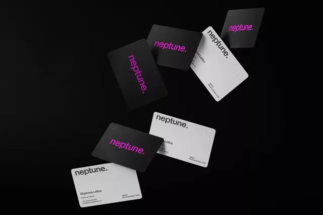
A dark-and-light stationery system for Neptune featuring bold magenta typography against black and white cards, arranged in a scattered 3D mockup.
Summary
A high-contrast stationery system using magenta-on-black and black-on-white cards displayed as a scattered 3D arrangement, demonstrating a bold minimalist brand identity.
Visual description
Six business cards and letterhead pieces scattered across a dark background at varying angles and depths, creating a dynamic composition. Black cards feature the word "neptune." in bold magenta italic sans-serif. White cards show the same wordmark in black or magenta, with fine-print contact details and small circular watermarks (possibly logos) embossed on several pieces. The cards appear rigid and substantial in the mockup, suggesting a premium stock. Text is minimal and left-aligned, with generous whitespace. The magenta italic wordmark is the anchor element, repeated consistently across all variations. Small gray embossed marks and text fragments visible on some cards suggest secondary brand elements.
Key takeaway
The extreme contrast strategy: magenta on black reads differently than magenta on white, forcing freshness on the same mark. The 3D mockup scatter communicates that this system applies to multiple touchpoints without showing a boring lineup. Italic wordmarks convey motion and modernity while maintaining legibility in minimal sizes. Embossed marks add tactile luxury without visual noise.
Reuse notes
High-impact for tech, creative, or fashion brands. The magenta neon against black and white especially suits contemporary or luxury positioning. Works for brands that move fast or value visual boldness. Requires restraint elsewhere (no competing imagery), so pairs best with clean, type-forward site designs. The scattered display is presentation only; the actual system is simple and production-friendly.
More like this







Keep what you find
A free account saves references to boards and can send you a weekly email of picks based on what you save.
To see every result, go Pro.