Preview image. Unlock full-res
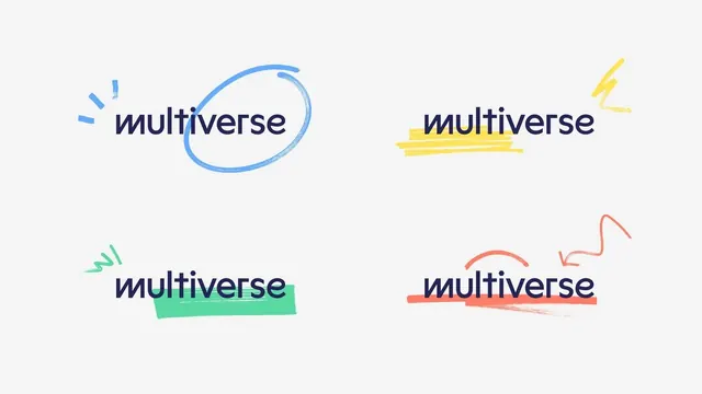
Four interpretations of the word 'multiverse' paired with distinct hand-drawn decorative marks in blue, yellow, green, and coral.
Summary
Four quick wordmark explorations of "multiverse" in navy sans-serif, each paired with a distinct hand-drawn decorative treatment in different colors and styles.
Visual description
Off-white background holds four quadrants, each pairing the word "multiverse" in a heavy navy sans-serif (identical across all four) with a unique hand-drawn embellishment. Top-left: loose blue circle with sketchy broken dashes floating left. Top-right: bold yellow parallel horizontal strokes with small lightning-bolt accent top-right. Bottom-left: soft mint-green filled rectangle with arrow marks to the left. Bottom-right: coral-red curved underline with an arc above, anchored by gestural marks. Each mark feels spontaneous, conveying different moods (geometric, energetic, organic, expressive) while maintaining compositional clarity through centered type.
Key takeaway
The exercise of pairing stable typography with varied decorative systems to explore mood shifts and positioning. Each decoration type (geometric line, stroke, filled shape, underline) conveys different visual energy. The restraint of using one wordform lets the accents do the conceptual work.
Reuse notes
Excellent as a wordmark identity concept sheet or pitch document showing brand flexibility across use cases. Works for brands wanting to signal creative adaptability. Each variation could stand alone as a distinct sub-brand or campaign marker. The hand-drawn quality softens corporate type and suggests playfulness or custom craft.