Preview image. Unlock full-res
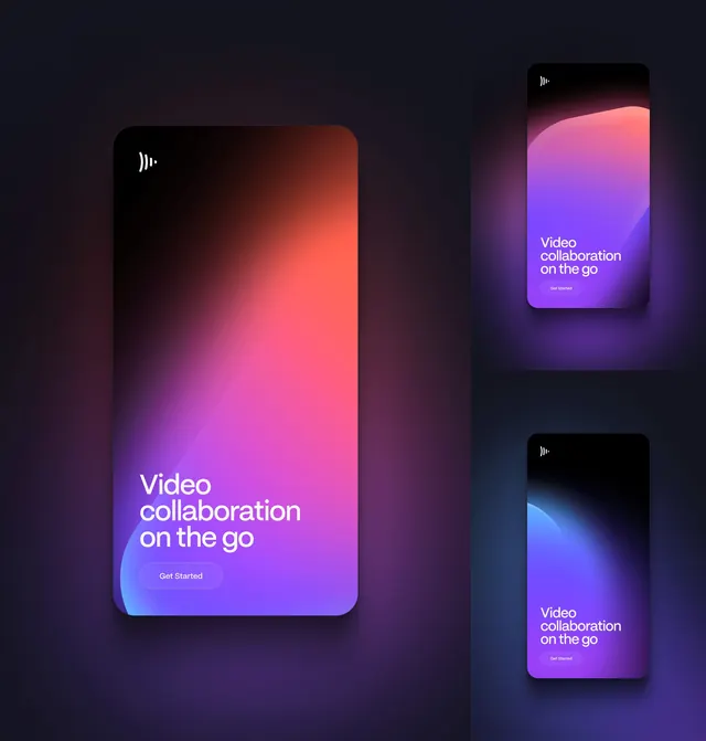
One large and two small mobile screens showing the same onboarding layout across three different brand gradients.
More like this
See all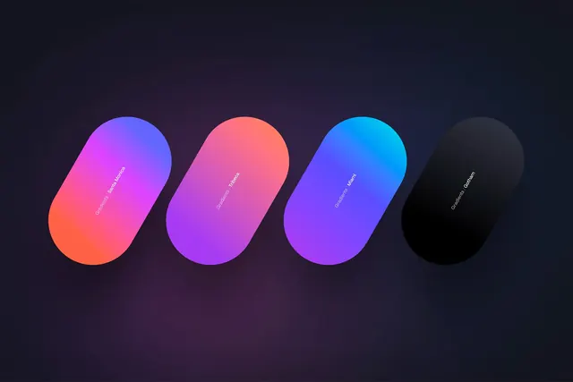
Summary
The same mobile onboarding screen rendered three times in three gradient colourways, sized as one hero and two supporting panels to show the layout is fixed while the colour is variable.
Visual description
A tall composition split into a wide left column and a narrower right column. The left holds one large rounded-corner screen: black at the top, blooming through coral and hot pink down the middle, resolving to violet with a blue swell curving in from the bottom left. The white arc mark sits small in the top left corner. Low in the screen, set left, is a three-line headline in a geometric white sans reading "Video collaboration on the go", and beneath it a pill button with a thin white outline and no fill labelled "Get Started". The right column stacks two smaller screens of the identical layout on slightly different dark backdrops: the upper one runs a coral crest into violet and blue, the lower one runs black into a cyan-blue bloom and down into violet. Each screen casts a soft coloured glow onto the dark surround.
Key takeaway
Showing one screen at hero scale next to two thumbnails of the same screen is a compact way to prove a colourway system without a grid of equal tiles. The ghost pill button is deliberately quiet so the gradient stays the loudest element.
Reuse notes
Good for a brand or app case-study frame where you need to demonstrate flexibility without adding new layouts. Works only when the underlying screen is simple enough to survive at thumbnail size, and the outlined button needs a light enough gradient underneath it to stay legible. Pairs naturally with a gradient palette frame elsewhere in the same deck.
More like this

Keep what you find
A free account saves references to boards and can send you a weekly email of picks based on what you save.
To see every result, go Pro.