Preview image. Unlock full-res
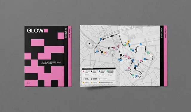
Printed square route guide shown as a pink-and-black pixel-block cover beside an opened city map spread with color-coded numbered markers.
More like this
See all
Summary
A festival route guide photographed as a pair: the graphic cover on the left and the functional map spread on the right, showing how one pixel-block language carries both.
Visual description
Two printed pieces lie flat on a mid grey backdrop with soft cast shadows. The left piece is a square cover in near-black, scattered with large pink rectangles of varying widths arranged on an invisible grid. Top left carries the lockup: "GLOW" in white caps followed by a pink square. Lower down, two small white lines read "10 to 17 NOVEMBER 2018" and "EINDHOVEN", with "1 euro" priced at the bottom left corner. A narrow black spine strip on the right edge carries rotated caps "ROUTE 2018" and "GLOW INFO", backed by a pink edge. The right piece is the same guide opened flat. Its inside is a pale grey street map of the city with roads in light grey, a heavy black walking route looping through the center, and dozens of small numbered squares in pink, black, blue and green marking stops. A white legend panel at the lower left lists four bilingual categories with their color chips, plus icons for side light, light show, museum special and info points.
Key takeaway
The cover and the interior share a single vocabulary of small colored squares: decorative on the outside, functional as map pins on the inside. Turning the route into thick black line work over a desaturated basemap keeps the branded color free to mean something.
Reuse notes
A good model for any festival, trail or exhibition guide where a graphic cover has to hand off to a dense wayfinding page. The four-category color coding is the limit before markers stop being distinguishable at print size. The pixel-block cover only works when the block grid stays coarse; small blocks read as noise.