Preview image. Unlock full-res
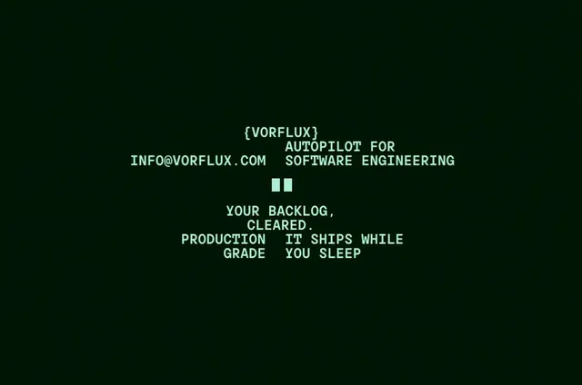
A monochromatic brand identity for Vorflux featuring monospaced type, circuit-dotted display lettering, geometric field-line graphics, and terminal-style data panels across a deep green and mint.
More like this
See all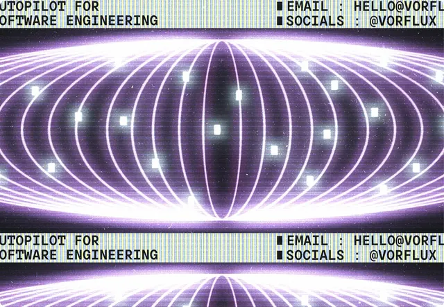
Summary
A monochromatic brand identity for Vorflux featuring monospaced type, circuit-dotted display lettering, geometric field-line graphics, and terminal-style data panels across a deep green and mint.
Visual description
A near-black green field holds a small cluster of all-caps monospaced text in pale mint, centered with a lot of empty space around it. A bracketed wordmark sits at the top, followed by a tagline and an email address that are staggered on offset baselines, then a block cursor made of two solid squares, then a second stacked message block in the same typeface. The whole thing reads like a terminal screen, with a single mint-on-dark color pair and no imagery.
Key takeaway
Commit to one terminal-style color pair and one monospaced face, and let ragged, staggered text lines plus a blinking-cursor block carry the brand voice without any graphics.
Reuse notes
Reach for this as a identity system reference. Pairs with typographic, geometric directions. Original by Ayush Soni.
More like this

Keep what you find
A free account saves references to boards and can send you a weekly email of picks based on what you save.
To see every result, go Pro.