Preview image. Unlock full-res
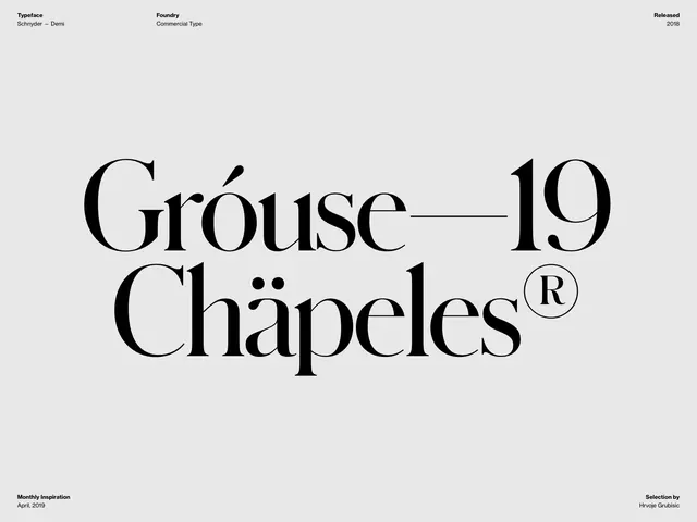
Typography specimen for Schmyder—Demi serif, displaying 'Gróuse—19 Chápeles' in oversized serif with horizontal divider line and metadata.
Summary
A type specimen sheet for Schmyder—Demi serif font, displaying 'Gróuse—19' on the top line and 'Chápeles' (with registered trademark) below, separated by a thin horizontal line, on a light gray background.
Visual description
Large-format serif typography specimen centered on a light gray page. Top line reads 'Gróuse' followed by an em-dash and '19' in a single oversized serif weight (Schmyder—Demi). Below, 'Chápeles' with an italic accent and a registered trademark symbol. A thin horizontal rule divides these two lines. Top-left metadata: 'Typeface Schmyder — Demi', 'Foundry Commercial Type'. Top-right: 'Released 2018'. Bottom-left: 'Monthly Inspiration April, 2019'. Bottom-right: 'Selection by Hrvoje Grubisic'.
Key takeaway
Clean, spacious presentation of serif letterforms with elegant proportions and subtle ornamentation (accents, trademark). The horizontal divider creates visual hierarchy and breathing room. Demonstrates restraint and premium aesthetic through typography alone.
Reuse notes
Reference for luxury brand identity or high-end editorial design. Works well for fashion, publishing, or architecture. The monochromatic scheme and serif choice convey sophistication and timelessness. Specimen format provides clear showcase of typeface character without competing graphics.
More like this


Keep what you find
A free account saves references to boards and can send you a weekly email of picks based on what you save.
To see every result, go Pro.