Preview image. Unlock full-res
Eleven-slide carousel showcasing a particle-based branding system for Omnilith exhibition and museum identity, with applications across print, environmental, and promotional materials.

Summary
A comprehensive branding system for the Omnilith exhibition that transforms a particle design tool into a cohesive visual identity, demonstrating parametric flexibility across multiple formats.
Visual description
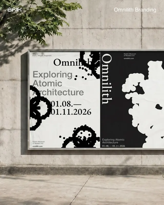
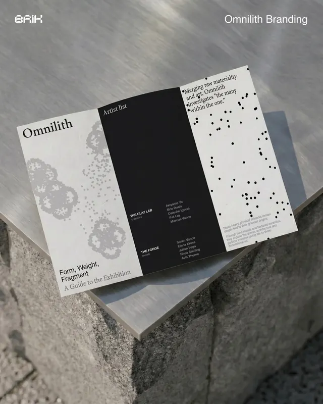
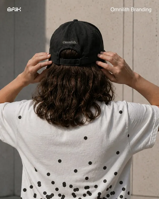
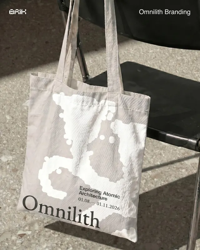
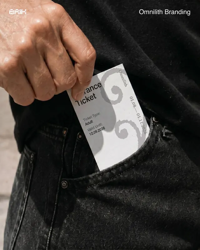
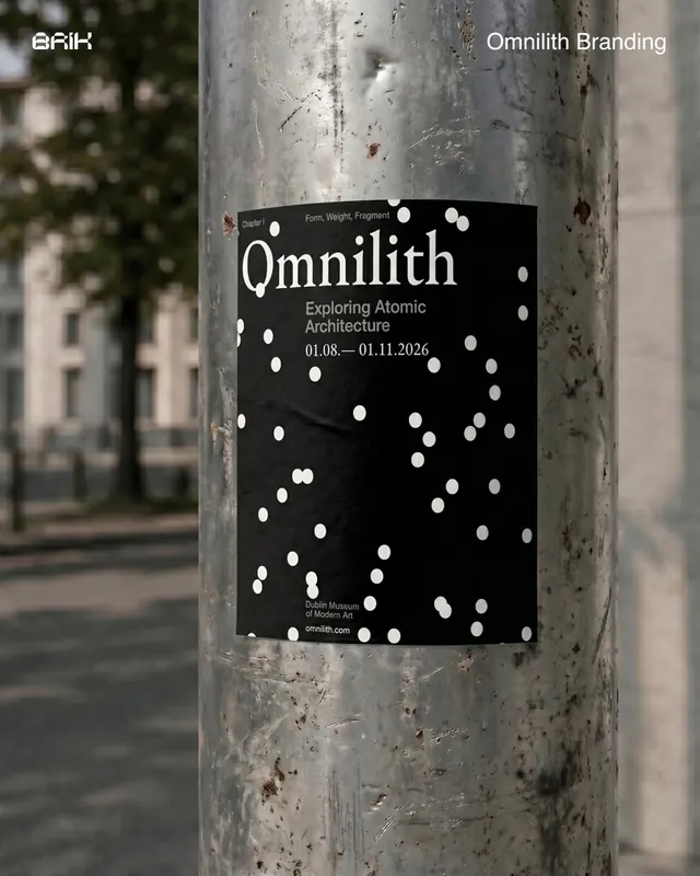
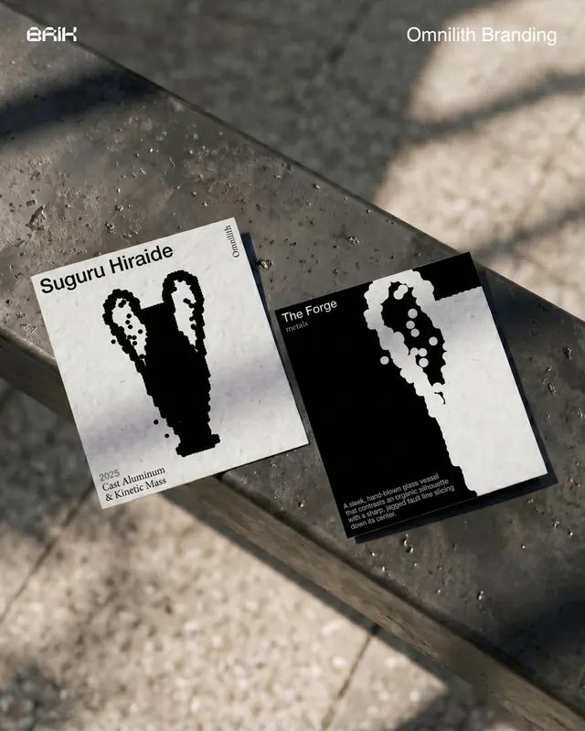
High-contrast black and white (monochrome) slides showing the evolution and application of a particle-based logo system. Slide 1 features an abstract composition of white circles and organic shapes on black - the generative mark. Subsequent slides show real-world applications: outdoor street signage with the brand applied to a black-framed billboard in an urban plaza, printed posters and collateral (magazine pages, printed bags, tickets, match books) with bold typography ("Omnilith", "Exploring Atomic Architecture") and the particle motif. Text: exhibition dates, venue (Dublin Museum of Modern Art), and tagline about atomistic architecture. Clean, editorial aesthetic with emphasis on how a single generative tool adapts across scales and materials.
Key takeaway
Using a parametric/generative mark as the core identity allows visual consistency while enabling flexibility. The monochrome palette ensures legibility at any scale. Showing real-world applications (street poster, bag, ticket) builds confidence that the system works across contexts, not just mockups.
Reuse notes
Strong model for cultural institutions, tech brands, and experimental studios. Works best when the tool story is part of the brand narrative - here, the fact that the identity came from remixing a design tool is central to credibility. The high contrast is essential; softer palettes may lose impact at poster scale.
From this post: Omnilith branding system with particle language
View post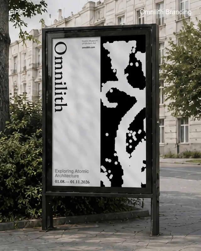
More like this



Keep what you find
A free account saves references to boards and can send you a weekly email of picks based on what you save.
To see every result, go Pro.