Preview image. Unlock full-res
Comprehensive brand identity system for a pilates studio featuring minimalist blue branding, refined typography, and systematic identity applications across collateral.

Summary
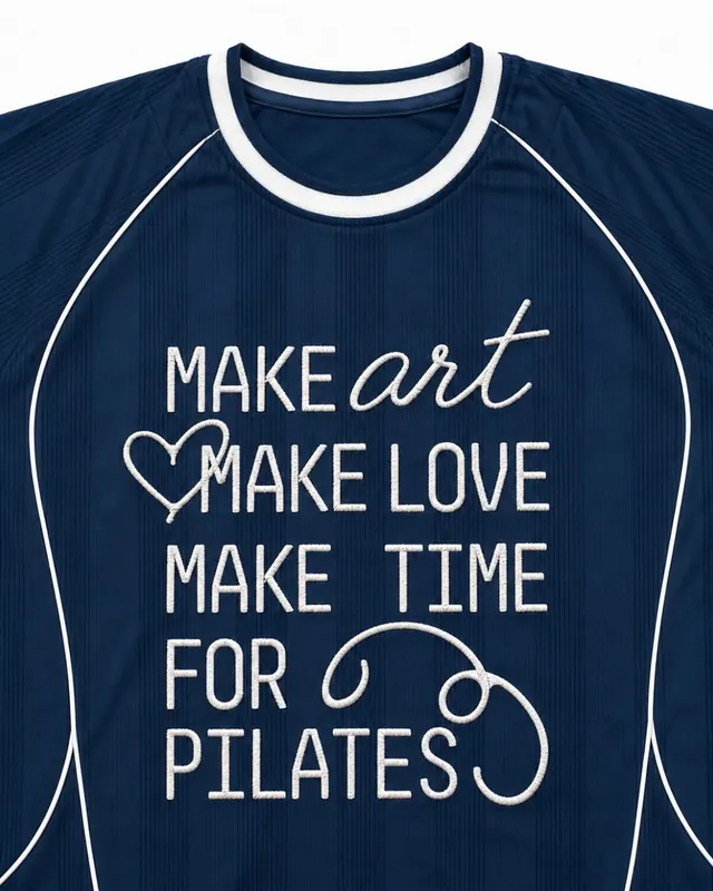
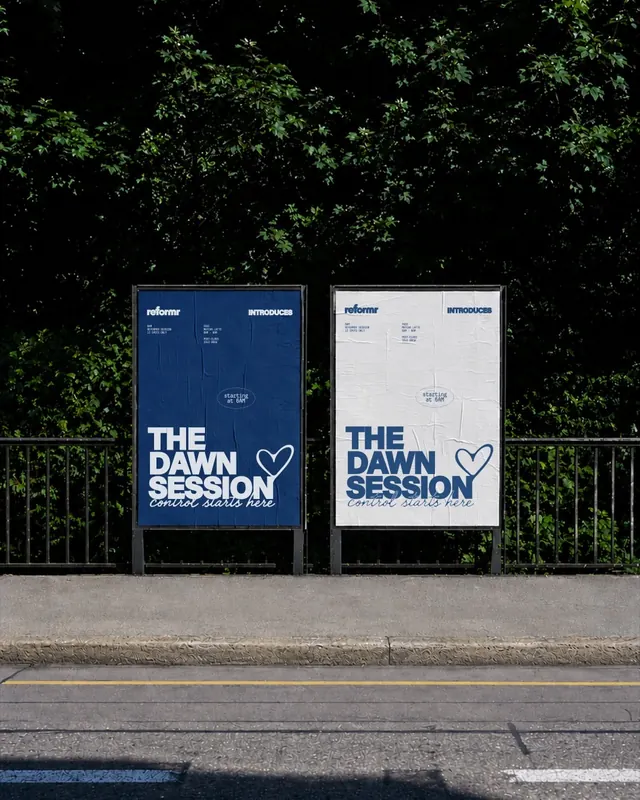
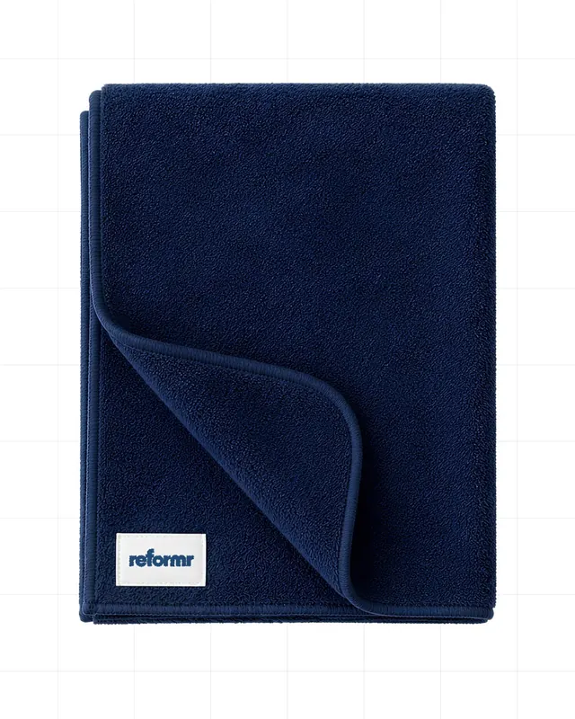
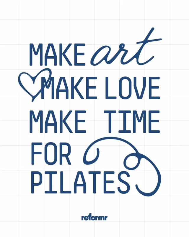
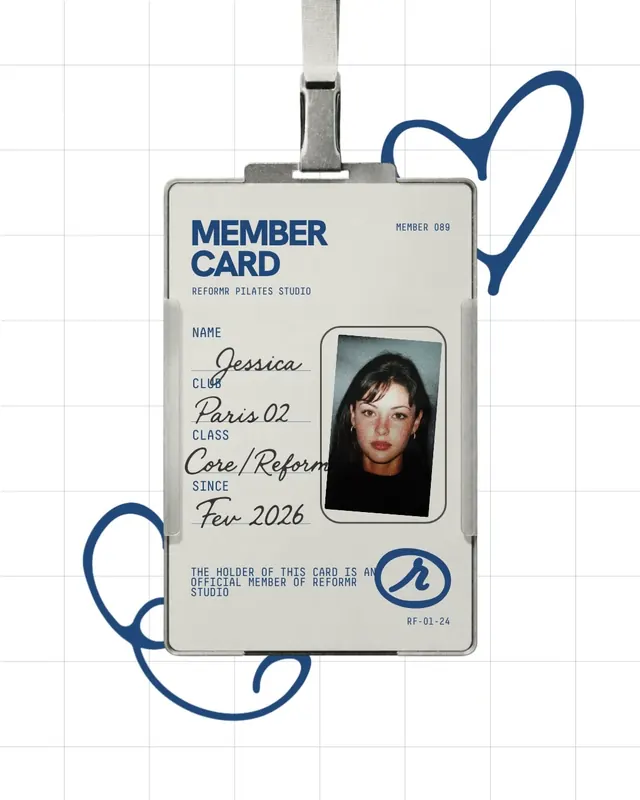
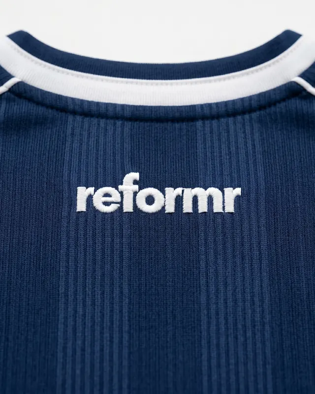
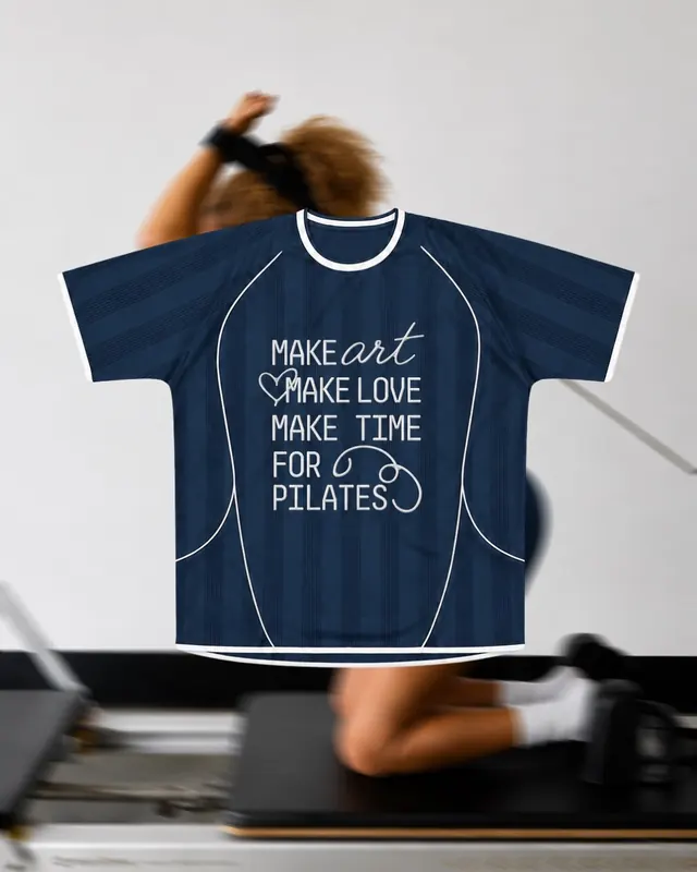
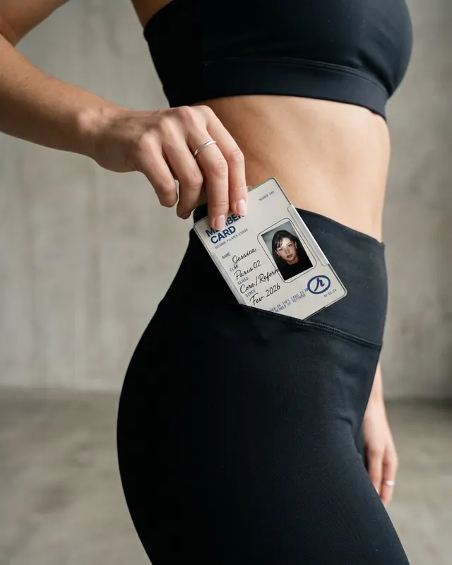
A sophisticated brand identity for REFORMR, a reformer pilates studio, featuring a minimalist blue and white palette, geometric decorative line elements, and systematic applications across membership cards, apparel, signage, and marketing collateral.
Visual description
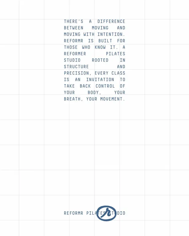
Clean grid background (light grey) throughout. Primary identity: bold uppercase sans-serif "REFORMR" in deep blue (#20487B). Organic curved line accents in matching blue appear as decorative flourishes. Secondary colors: light blue (#bad6eb) and cream. Membership card design features clean typography, passport-style photo area, and signature line. Applications include branded athletic apparel, towels, posters, and environmental signage. Type hierarchy uses condensed sans-serif throughout. Final slides display a color palette guide and application guidelines. Overall aesthetic is refined, minimal, and contemporary.
Key takeaway
The restrained palette and geometric line accents create premium positioning without visual noise. Consistent type treatment and systematic application guidelines make this a truly integrated brand system. The decorative curves humanize otherwise austere minimal design.
Reuse notes
Excellent reference for fitness, wellness, or health-focused brands seeking sophisticated, modern identities. The duotone palette creates high contrast in both print and digital. Works particularly well for premium or luxury service brands. The geometric line accents provide visual interest without compromising minimalism. Strong foundation for a comprehensive brand system spanning physical and digital touchpoints.
From this post: REFORMR Pilates studio brand identity carousel
View post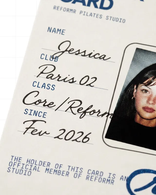




More like this





Keep what you find
A free account saves references to boards and can send you a weekly email of picks based on what you save.
To see every result, go Pro.