Preview image. Unlock full-res
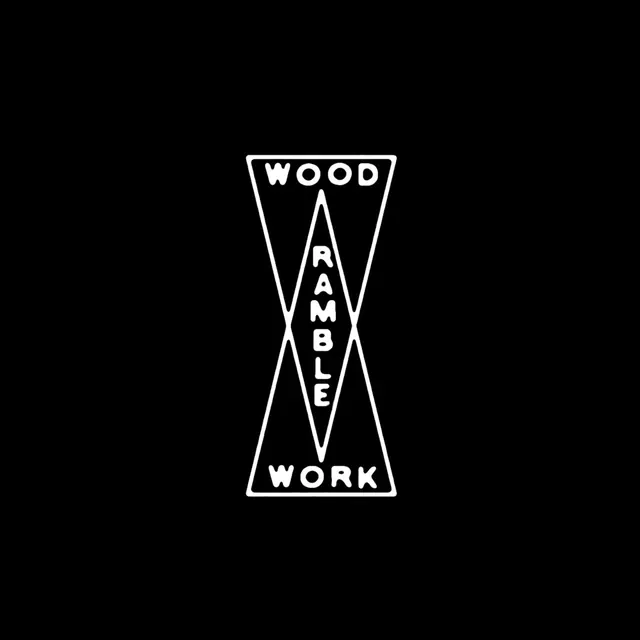
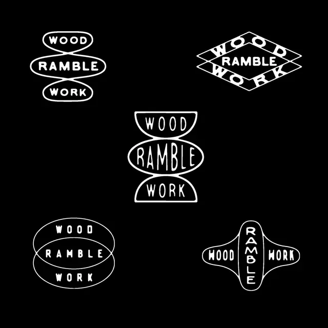
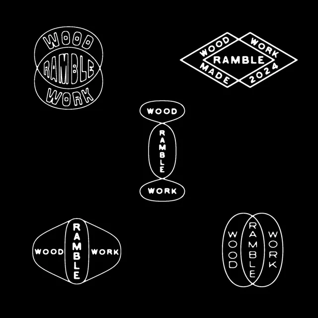
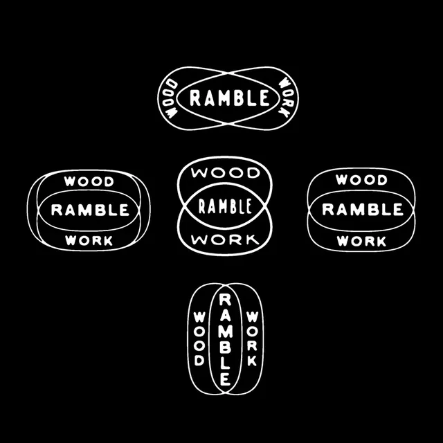
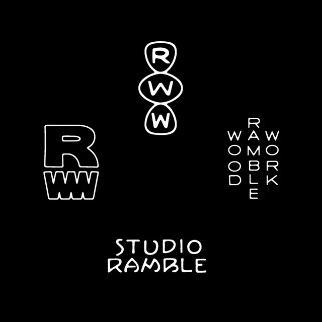
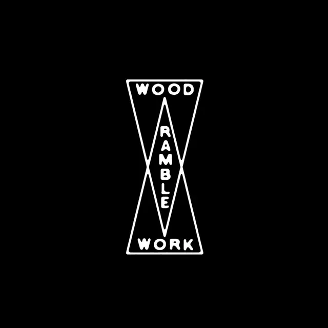
A 5-slide carousel of typographic logo mark variations for a craftsman woodworking studio, all rendered as outlined geometric shapes on black.

Summary
A typographic exploration carousel showcasing five playful variations of the Ramble Wood Work mark. Each composition arranges the brand name and variations in different outlined geometric containers - trapezoids, diamonds, ovals, crescents - suggesting possible forms for burned or stamped applications on wooden products.
Visual description
Black background throughout. White outlined geometric shapes frame repeated arrangements of the words "WOOD," "RAMBLE," and "WORK" in caps, sans-serif. Each slide presents the three words in a different spatial configuration: a tall trapezoid with vertical stacking, nested ovals in a diamond, concentric ovals in a circle, side-by-side ovals, and paired crescents. The line weights are consistent and hand-drawn in character. The final slide includes text at the bottom: "STUDIO RAMBLE" in outline form with additional geometric forms on the left.
Key takeaway
The constraint of fitting type into outlined geometric shapes drives expressive variation. This is an effective way to test multiple visual directions for a mark while maintaining coherent identity - ideal for a maker exploring how their logo might translate into physical stamps, burns, or presses.
Reuse notes
Strong reference for logo exploration decks, especially for craft, maker, or product-focused brands. The outlined, geometric approach works well for brands considering physical application and tactile branding. Effective for presentations showing design iterations within a disciplined visual system.