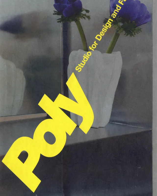
Preview image. Unlock full-res
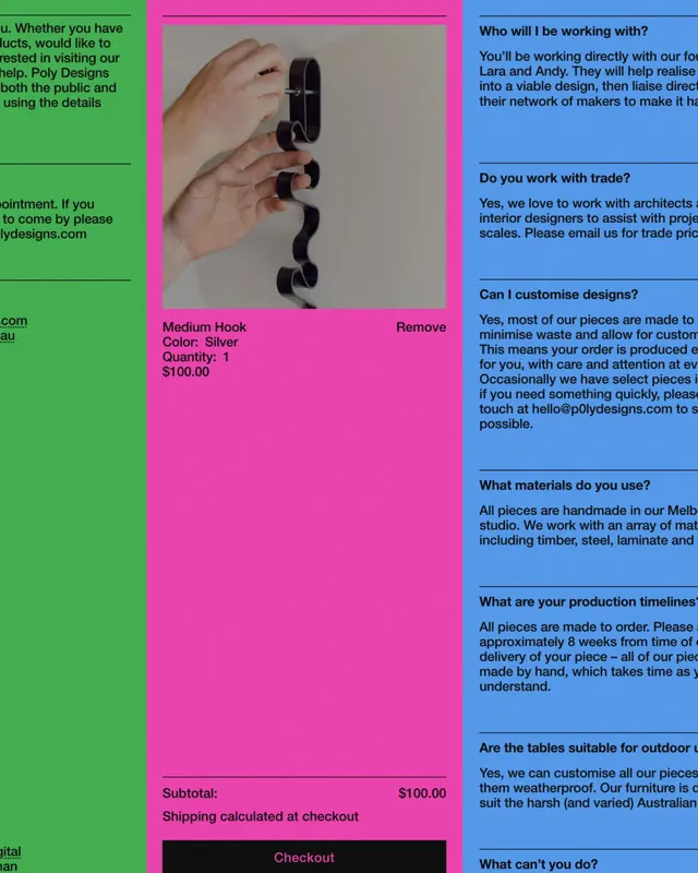
Vibrant brand identity system for a Melbourne design and fabrication studio with bold yellow type, bright green accents, and a minimalist product-focused website.

Summary
A complete brand identity for Poly, a Melbourne design and fabrication studio, featuring bold neon-yellow wordmark, bright green accents, and a minimalist e-commerce website showcasing handmade product hooks and furniture pieces.
Visual description
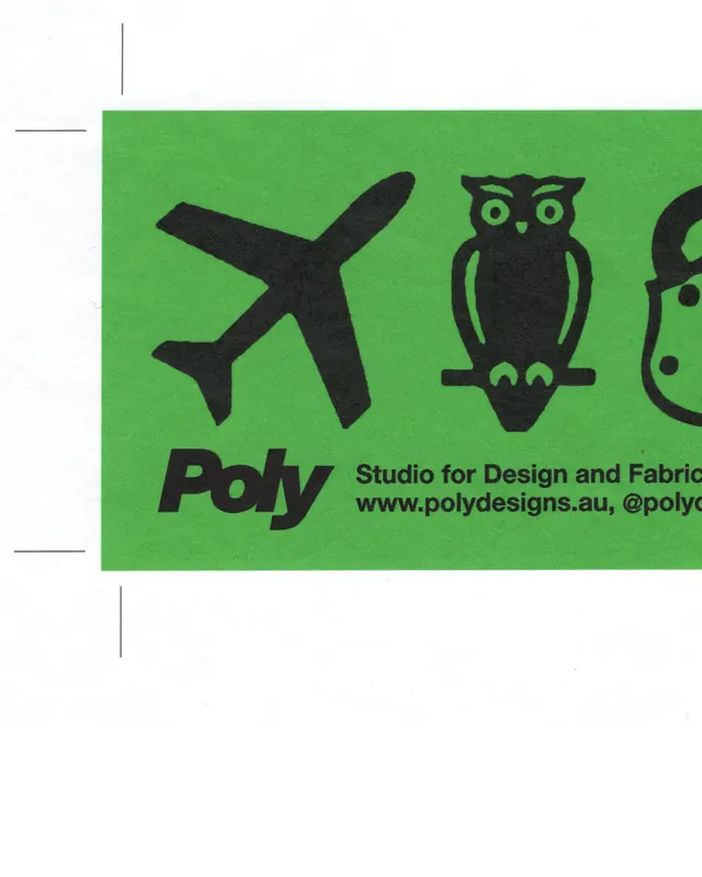
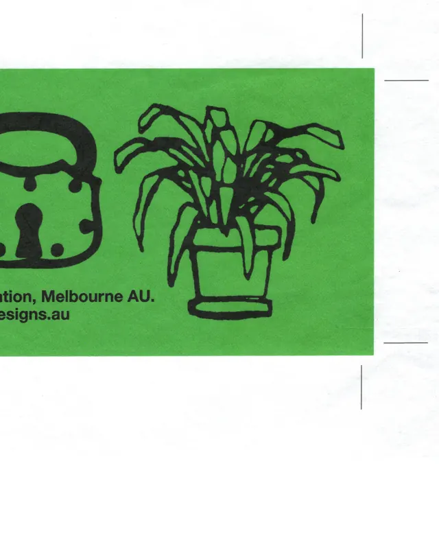
The carousel spans brand application across multiple touchpoints. Slide 1 shows the primary wordmark rendered in bright yellow (neon-grade luminosity) positioned diagonally over a white vase and purple flowers on dark ground. Slide 2 displays the full website: a clean split-layout with left navigation menu in bright blue, central product grid showing four modular hooks (large hook, medium hook, small hook, steel mirror) with pricing, and right column containing FAQ text in dark blue and green sections. Slides 3-4 are close-ups of the wordmark treatment with simple line-art icons (airplane, owl, lock, yarn) rendered in solid black on the bright green background. Slide 5 shows the website's information architecture: FAQ section with alternating magenta, green, and blue columns and clear typographic hierarchy in bold sans-serif. Throughout: high-contrast color blocking (neon yellow, bright green, hot magenta, cool blue), generous white space, and minimalist geometric forms. The aesthetic balances craft sensibility (handmade products) with tech-forward graphic language (bold type, modular grid, saturated neons).
Key takeaway
The neon-bright limited palette applied decisively across brand and digital-not a whisper, but a shout. The color-blocking strategy creates visual rhythm and guides attention through the e-commerce experience. The wordmark's custom geometry (curves and angles) works equally well as a mark and at scale in signage.
Reuse notes
Excellent template for craft/maker brands needing a modern, energetic identity with premium positioning. Works well for portfolio-driven e-commerce (handmade, limited-edition, or bespoke products). The bright color scheme demands high contrast and plenty of breathing room-works best on light backgrounds. Website layout is mobile-friendly and icon-based, making it adaptable to different product categories. Strong for design studios, furniture makers, and artisan brands targeting younger audiences.
From this post: Poly Studio brand identity and website
View post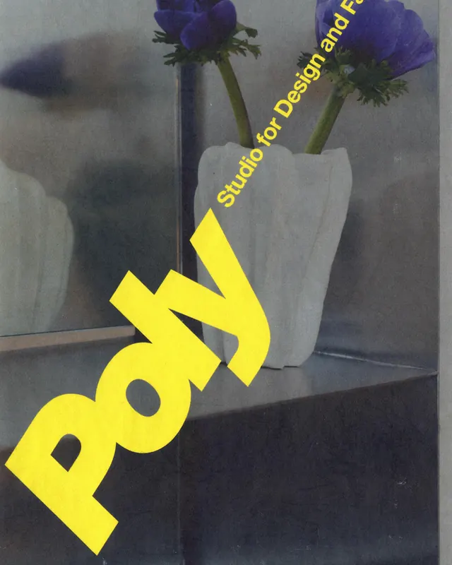
More like this

Keep what you find
A free account saves references to boards and can send you a weekly email of picks based on what you save.
To see every result, go Pro.