Preview image. Unlock full-res
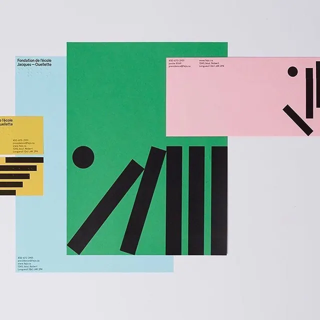
A color-blocked stationery suite for an école foundation, using green, pink, blue and yellow sheets with falling black bars and circle motifs.
Summary
A geometric stationery system for "Fondation de l'école Jacques-Ouellette," built from solid color sheets (green, pink, sky blue, yellow) carrying black tipping-domino bars and a recurring circle.
Visual description
Several printed pieces overlap in a flat-lay on pale grey. The largest is a green sheet whose lower half holds a row of vertical black bars that progressively tilt, like falling dominoes, beside a solid black circle. A pink envelope at top-right repeats the same tipping-bar and circle motif in miniature. Beneath them a sky-blue letterhead carries the foundation's name set in a small, clean black sans-serif (with what reads as braille dots beside it) and contact details in the corners. A yellow business card at left echoes the black bar pattern again. The shapes are flat, hard-edged, and recolored across each surface so the same geometric language ties the whole suite together.
Key takeaway
A single geometric motif (tilting bars plus one circle) reused at different scales and recolored per piece, so one simple idea unifies an entire stationery system. The inclusion of braille alongside the wordmark turns an accessibility requirement into part of the visual identity.
Reuse notes
A strong model for education, nonprofit, or cultural-institution branding that needs warmth and energy without losing structure. The recolor-the-motif approach scales cleanly to posters, signage, and digital. Works best when the palette stays to a few flat, confident hues; adding gradients or photography would dilute the graphic clarity.
More like this

Keep what you find
A free account saves references to boards and can send you a weekly email of picks based on what you save.
To see every result, go Pro.