Preview image. Unlock full-res
A seven-slide carousel revealing the brand identity for Barr, a renovated North Sea tavern in Copenhagen, featuring minimalist wordmarks, product photography, and material applications.

Summary
A comprehensive brand-identity carousel for Barr, a renovated North Sea tavern reopening in Copenhagen (June 2026), centered on a minimalist sans-serif wordmark and elevated through luxury product photography, collateral applications, and upscale environmental design.
Visual description
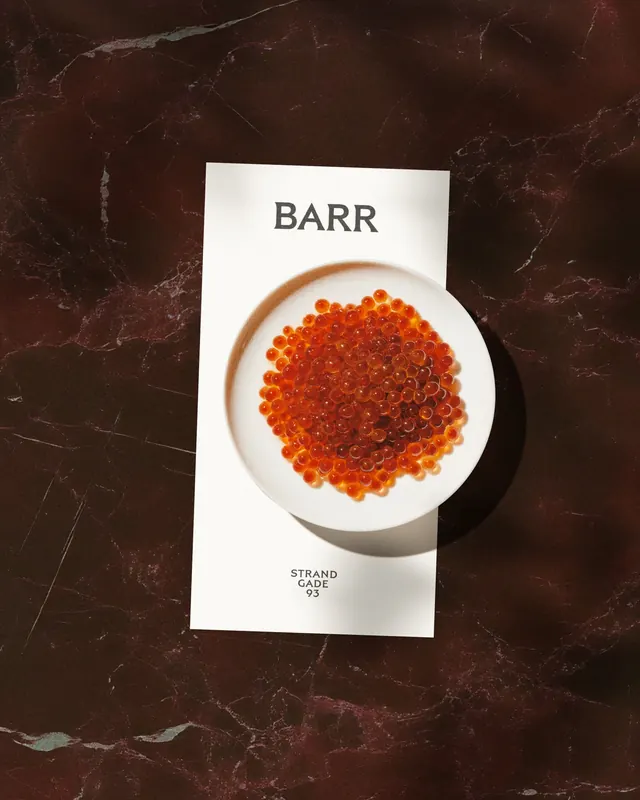
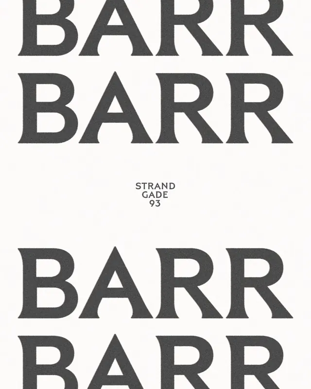
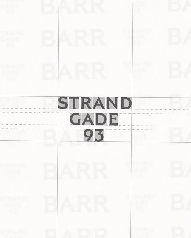
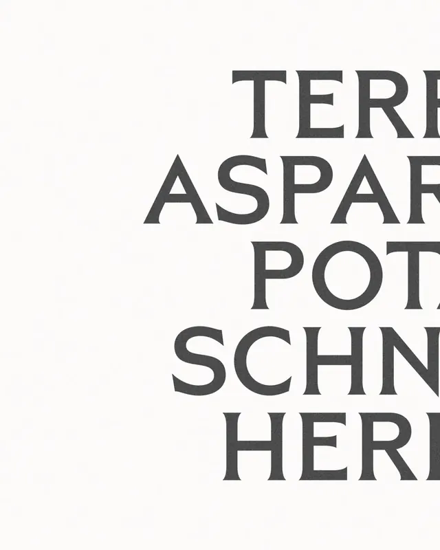
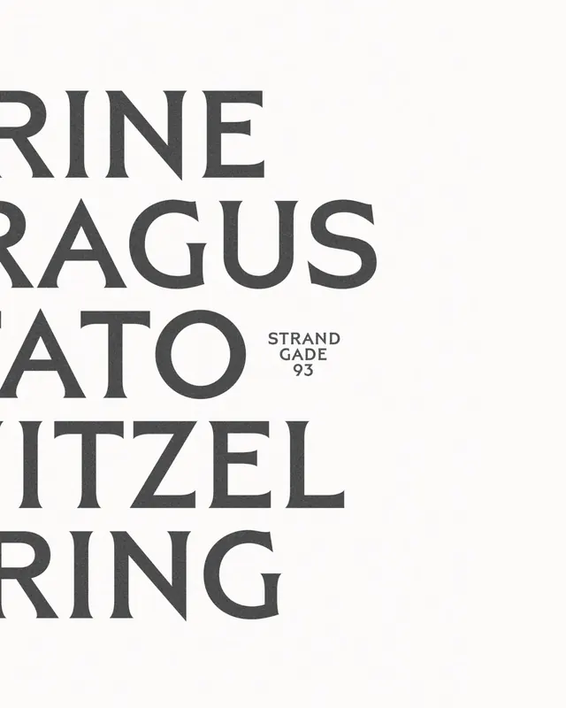
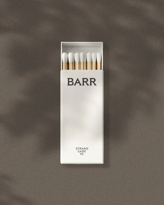
Slide 1 (the hero) displays a white card with the word "BARR" in sans-serif type at the top, a vibrant overhead photograph of bright orange roe (caviar) in a shallow white bowl at center, and address ("STRAND GADE 93") at the bottom. The typography is restrained and modern. Slides 2–3 show variations of the wordmark and logo lock-up in monochrome and full-color contexts. Slides 4–6 reveal collateral: minimalist posters echoing the wordmark ("BARR," "STRAND GADE 93," "BARR RR"), product shots of caviar and garnishes, and environmental applications (what appears to be matchbook or packaging design). Slide 7 shows a cigarette pack or similar object with the Barr branding applied. Throughout: a palette of black, white, warm grays, and the natural reds/oranges of seafood. Type is bold, all-caps, and sans-serif, sized large relative to white space.
Key takeaway
The roe photograph is the hero-a single, carefully lit product shot that communicates luxury and specificity about what the establishment serves. The wordmark itself is secondary and intentionally simple (just the name, well-spaced) so the identity lives in the application and photography. Pairing brutalist/minimalist type with warm, tactile food photography creates sophistication without coldness. The address becomes a design element rather than utility copy.
Reuse notes
Excellent model for upscale restaurant or food-centric hospitality branding. The minimalist wordmark paired with luxury product photography is a formula that reads high-end and editorial. Use case: any establishment where the product or ingredient IS the brand story (caviar bars, fine dining, specialty markets). The collateral system (posters, matchbooks, packaging) all follow the same restraint-no decoration, just type and photography. Works well on dark surfaces and in sophisticated environments.
From this post: Barr Restaurant Brand Identity System
View post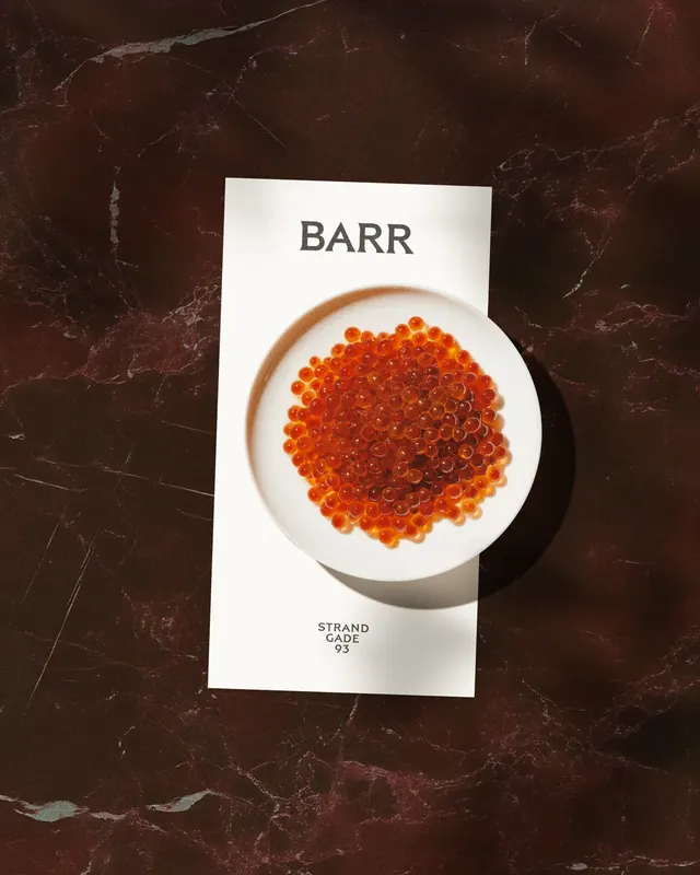
More like this



Keep what you find
A free account saves references to boards and can send you a weekly email of picks based on what you save.
To see every result, go Pro.