Preview image. Unlock full-res
Six-slide brand identity for Stripes, a design journal exploring the intersection of design and sport, with retro aesthetic and vintage color palette.

Summary
A six-slide brand identity for Stripes, a design publication celebrating the intersection of design and sport, characterized by vintage typography, retro imagery of classic sports culture, and a modern-yet-nostalgic color palette balanced between deep greens, warm creams, and red accents.
Visual description
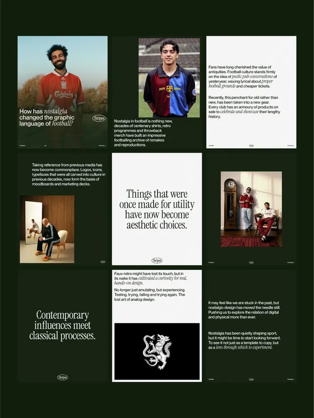
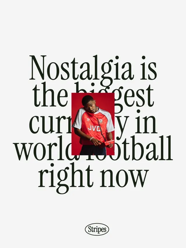
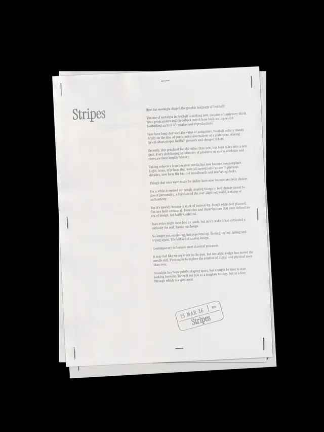
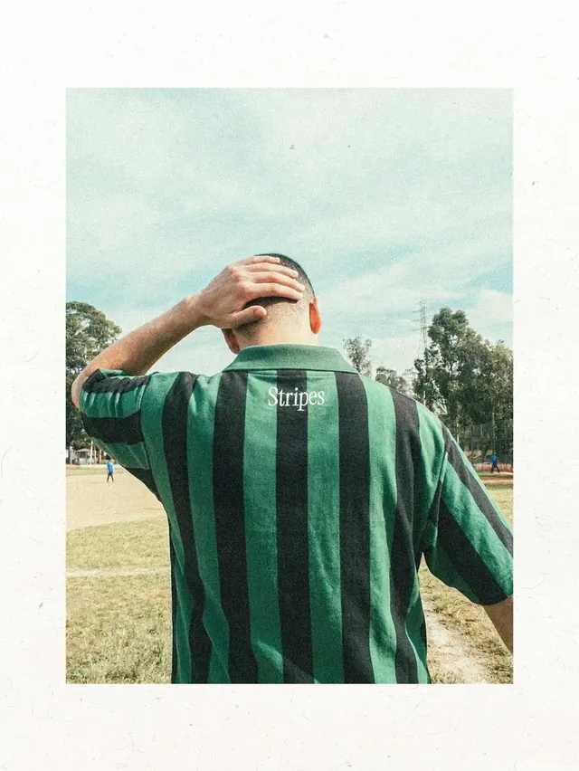
Slide 1 (cover image) displays the Stripes wordmark in a playful serif typeface repeated across a textured background, setting a typographic tone. Slide 2 shows a packaged magazine cover against deep forest-green, featuring a young athlete in a striped sports jacket with the subtitle "fashion on the terraces" - the plastic wrap and off-center positioning create a casual retail aesthetic. Slide 3 appears blank or highly minimal. Slide 4 introduces a conceptual spread: a large-scale serif headline ("Nostalgia is the biggest currency in world football right now") layered over a photograph of a person wearing a vintage Arsenal kit (iconic red), combining editorial typography with historical sports imagery. Slide 5 is not visible in the reviewed set. Slide 6 captures lifestyle photography of a figure from behind wearing a striped vintage rugby or football jersey on an open field, shot in saturated film-like color with that characteristic hazy light of 1970s/1980s sports photography. The typography oscillates between refined serif display faces and clean sans-serif; the color story blends retro greens and creams with strategic red accents and deep forest tones, evoking vintage sports culture while feeling intentionally designed rather than purely nostalgic.
Key takeaway
The brand successfully straddles "designed" and "authentic" - it feels curated and contemporary but never ironic. The textile pattern (stripes) becomes both literal (sports jerseys) and metaphorical (design language). The serif display type feels respectful of sports' heritage without pastiche; combined with period-appropriate photography, it creates genuine nostalgia rather than parody. The color palette (forest green, cream, red) is timeless because it draws directly from vintage kits and stadium aesthetics.
Reuse notes
Excellent reference for any sports, lifestyle, or publication brand targeting audiences with cultural/nostalgic values. The balance of playful typography (repeated Stripes wordmark) with serious editorial photography is particularly effective. Works well for niche publications, heritage brands entering modern spaces, or contemporary brands that want depth without appearing dated. The striped pattern is endlessly adaptable as a sub-brand device. Caution: the success relies on authentic sports/design knowledge - appropriative use of retro aesthetics without genuine connection reads as parody.
From this post: Stripes journal brand identity
View post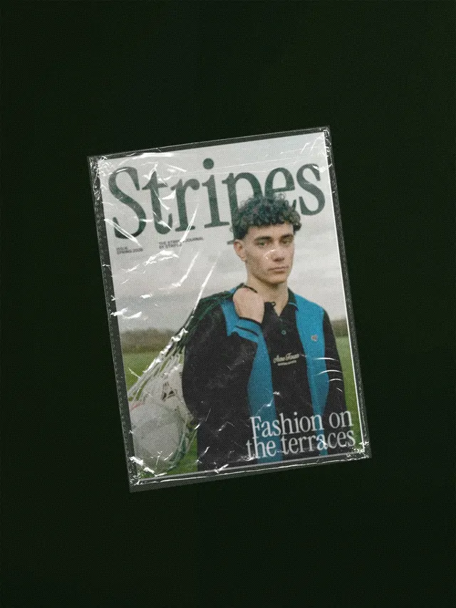
More like this
Keep what you find
A free account saves references to boards and can send you a weekly email of picks based on what you save.
To see every result, go Pro.