Preview image. Unlock full-res
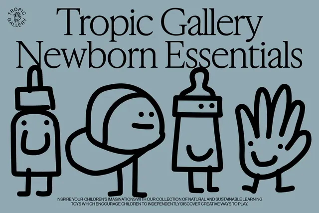
A playful brand identity system for children's learning toys featuring illustrated character figures and a clean product layout.
Summary
A playful brand identity system for a children's toy company, combining illustrated character figures with clean typography and a calm, muted color palette.
Visual description
A sage green background hosts four simple line-illustrated characters representing product categories: a baby bottle with a smiling face, a baby with a round head, a bottle with a flat expression, and a hand gesture. The brand name "Tropic Gallery" appears above in a bold sans-serif, with "Newborn Essentials" below. A small circular logo sits at top left. Supporting text explains the brand's focus on natural and sustainable learning toys. The illustration style is deliberately childlike yet sophisticated, using minimal line weight and warm tones.
Key takeaway
Illustrated character figures create emotional connection and brand memorability, while structured layout and calm colors keep the overall feel modern and trustworthy rather than chaotic.
Reuse notes
Excellent reference for children's brands, educational products, and e-commerce packaging. The balance between playful illustration and minimalist typography appeals to both kids and parents. Works well at multiple scales.
More like this
Keep what you find
A free account saves references to boards and can send you a weekly email of picks based on what you save.
To see every result, go Pro.