Preview image. Unlock full-res
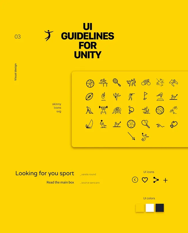
A comprehensive UI design system guide featuring a grid of icons, typography specimens, and layout components on a solid yellow background.
Summary
A comprehensive UI design system guide featuring a grid of icons, typography specimens, and layout components on a solid yellow background.
Visual description
A bright yellow layout featuring a large black heading, a dense grid of diverse line-art icons, and various UI elements like buttons and input fields. The design uses a strict grid system with clean black typography.
Key takeaway
High-contrast color schemes combined with a dense icon library create a highly functional and organized design system.
Reuse notes
Use the grid layout and icon style for creating consistent UI components across a digital product.
More like this





Keep what you find
A free account saves references to boards and can send you a weekly email of picks based on what you save.
To see every result, go Pro.