Preview image. Unlock full-res
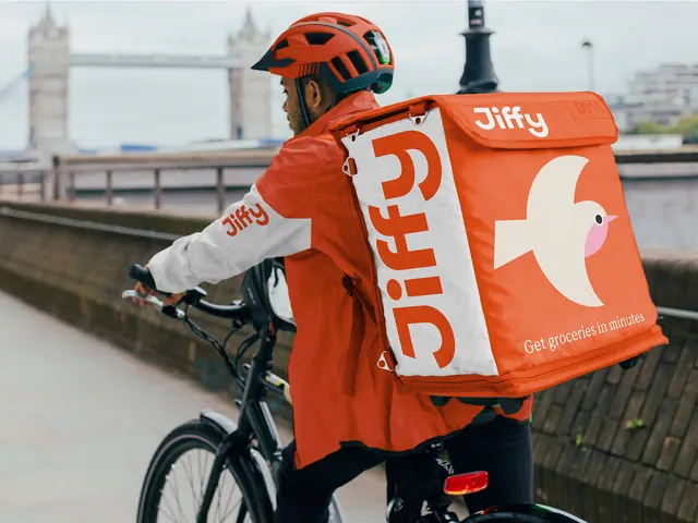
A grocery courier photographed on a London bridge in an orange and white branded jacket with a cube delivery backpack carrying the wordmark and bird mark.
More like this
See all
Summary
The identity applied to a working courier kit: an orange and white cycling jacket and a large cube backpack that turns the rider into a moving billboard.
Visual description
A rider seen from behind and slightly above, one hand on the handlebars, with Tower Bridge and the river soft and out of focus behind. The jacket is split orange and white with a small orange wordmark on the white sleeve. The cube backpack does the heavy lifting: a white vertical panel down its left face carries the wordmark rotated ninety degrees in orange, the orange top flap repeats the wordmark in white beside a small unit number in an outlined box, and the large orange right face holds the cream bird mark with its pink cheek. A serif line reading Get groceries in minutes sits in cream under the bird. The helmet matches the jacket orange.
Key takeaway
Treating the delivery bag as the primary media buy: three faces, three different crops of the same identity, so the brand reads from any angle in traffic. The rotated wordmark on a white panel gives the orange mass a second, quieter beat.
Reuse notes
A model for last-mile delivery, courier, and field-service brands where the uniform is the main out-of-home surface. The system depends on one saturated brand color holding against grey urban backgrounds, and on a mark simple enough to survive at motion and distance. The serif tagline against the geometric sans is the detail that keeps it from feeling like generic gig-economy orange.