Preview image. Unlock full-res
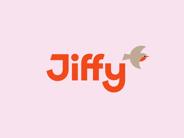
The Jiffy logo lockup presented large on pale pink, with a rounded geometric orange wordmark and a taupe robin flying off the final letter.
More like this
See all

Summary
The primary lockup shown alone on a flat pastel field: a heavy rounded orange wordmark with a taupe robin perched at the end of it, mid flight.
Visual description
Pale pink fills the frame edge to edge. Centered slightly low, the word Jiffy is set in a very heavy geometric sans with fully rounded terminals, a dotted i, a long descending single-storey y, and a J whose tail curls back under the word. Letterforms are drawn as thick rods with generous counters, so the word reads as one dense orange mass. To the right, a small taupe bird built from three flat shapes, a swept wing, a wedge tail and an orange breast, leans forward with its thin orange beak and a white ringed black eye. The bird sits at cap height and overlaps nothing, giving the lockup a clear silhouette.
Key takeaway
Two colors, no outlines, no gradients, and the mark still carries character because the bird is drawn in the same rounded geometry as the type. Pairing a loud brand orange with a quiet muted taupe stops the lockup from shouting when it is shown at scale.
Reuse notes
A reference for consumer delivery, grocery, and app brands that need warmth without cartoon. The pastel backdrop is a presentation choice, not a brand neutral, so test the lockup on white and on full orange before adopting it. The descending y and the bird both eat horizontal space, which makes this lockup awkward inside tight square containers such as an app icon.
More like this

Keep what you find
A free account saves references to boards and can send you a weekly email of picks based on what you save.
To see every result, go Pro.