Preview image. Unlock full-res
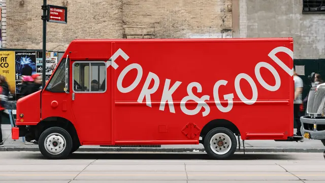
A red step van parked on a city street with the curved Fork & Good wordmark running the full length of its side in white.
More like this
See all
Summary
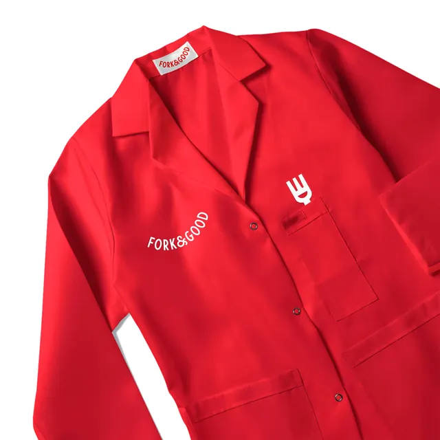
Vehicle livery reduced to one move: an all red step van with the wordmark arced across the entire cargo body in white, edge to edge.
Visual description
A wide side on shot of a red walk in delivery van at the curb, filling most of the frame. The wordmark is set in a heavy geometric sans, all caps, and follows a shallow downward then upward curve so the letters ride a smile shaped baseline; individual letters are rotated to sit on that curve. It starts at the front of the cargo box and the final letters are cropped by the rear edge of the vehicle, so the type feels larger than the surface holding it. The van is uniformly red including the bumper, cab, and wheel arches, with white rims. Behind it a weathered brick and painted stone wall carries a row of concert posters, a red no standing sign hangs from a pole, and pedestrians pass in motion blur at both sides. The foreground is grey asphalt with pale lane lines. No fork mark, no url, and no secondary copy appear.
Key takeaway
One curved wordmark, one color, no supporting elements. Letting the type run off the back edge instead of fitting inside the panel is what makes the graphic read as confident rather than applied.
Reuse notes
Good reference for fleet or delivery branding in food and consumer categories, and for showing a wordmark at its largest possible scale. The curved baseline needs a wordmark short enough to stay legible when rotated per letter. Shooting in a real street with blurred passersby sells the scale far better than a studio render would.