Preview image. Unlock full-res
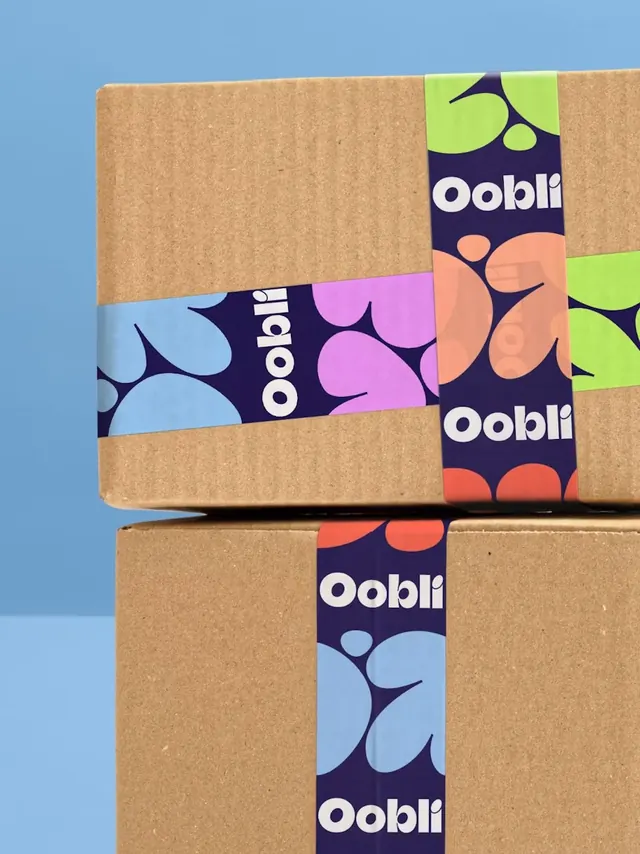
Two kraft shipping cartons taped with a navy branded tape whose blob shapes shift colour along its length.
More like this
See all

Summary
A tight portrait photograph of branded packing tape doing all the identity work on two otherwise plain kraft cartons.
Visual description
Two corrugated brown boxes are stacked against a flat mid-blue backdrop, lit so the upper box casts a soft shadow on the lower one and the join between wall and floor sits behind them. Navy tape runs over each box: one strip crosses the top box horizontally and another runs vertically over its corner and down the front, with a third continuing down the centre of the lower box. The tape is printed navy with the Oobli wordmark repeated in white lowercase, oriented along the run so the horizontal strip reads sideways where it crosses the box. Between the wordmarks the tape carries large flat blob shapes that change colour segment by segment: pale blue, lilac, lime and coral, cropped so partial shapes bleed off both edges. The kraft corrugation and small paper flecks are visible, and the tape has a slight satin sheen against the matte board.
Key takeaway
Only one printed element is needed to brand a plain carton, and shifting the blob colour along the tape means a single roll produces visual variety across a stack. Letting the wordmark run in whatever orientation the tape lands in makes the whole thing feel casual rather than precious.
Reuse notes
A cheap, high-impact route for a direct-to-consumer brand that ships in stock kraft cartons. Works best photographed tight, where the tape fills a meaningful share of the frame. Note that the repeated wordmark will be cut mid-word at every tape end, so the mark has to survive partial cropping.