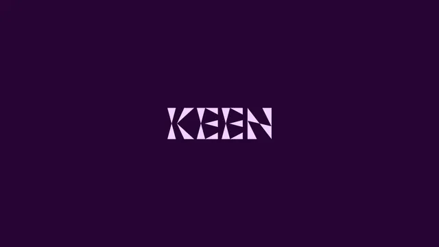
Preview image. Unlock full-res
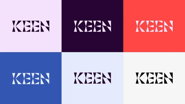
The KEEN logotype in pale lilac, centered small on a flat deep plum field, its letters cut into triangular shards.
More like this
See all
Summary
A single presentation frame of the KEEN wordmark, set small and centered in pale lilac on flat deep plum so the shard construction of the letters is the only thing to look at.
Visual description
The field is an even, unlit deep plum with no gradient or texture. The wordmark occupies roughly a quarter of the frame width and sits on the horizontal center line, slightly above optical center. Four capitals, K E E N, are drawn at a uniform cap height with near-zero letterspacing so the forms almost touch. Each letter is built from solid triangles with slivers of background cutting through: the K splits into an upper and lower wedge with a thin diagonal gap, both E characters read as stacked triangular bars whose arms taper to points, and the N is a pair of angled wedges divided by a hairline diagonal. The result looks like a solid slab that has been fractured. No tagline, no supporting mark, no frame.
Key takeaway
Cutting the counters and joints as splinters rather than straight strokes gives a plain geometric sans a glass-fracture reading without adding a symbol. Setting it small on a large empty field is what makes the fracture detail feel deliberate rather than decorative.
Reuse notes
A clean model for a logo presentation frame: one color, one mark, huge margins. The shard cuts are fragile at small sizes and on textured stock, so a solid alternate is likely needed for embroidery, favicons, and etching. Works best on dark grounds where the slivers read as light.