Preview image. Unlock full-res
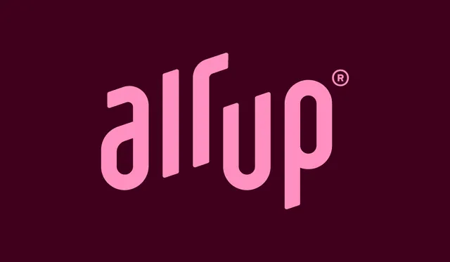
The air up wordmark in soft pink, set large and slightly rotated on a deep plum field.
More like this
See all
Summary
A single-color wordmark presentation: the lowercase "air up" logotype in soft pink, tilted off the horizontal, filling most of a deep plum frame.
Visual description
The frame is a flat deep plum rectangle with nothing on it but the logotype. The wordmark reads "air up" in lowercase, drawn as a custom rounded sans with heavy even strokes, flat cut terminals and very tight counters. The whole lockup sits on a rising diagonal baseline, so the letters climb from left to right, and the individual letterforms are sheared so their verticals stay near-upright against that tilt. The "i" has no separate dot, its stem simply runs full height next to the "r", which reads as a single connected pair. A small circled registered trademark mark sits at the upper right of the "p", slightly darker pink than the letters. Generous margin surrounds the mark on all sides, and there is no other copy, rule or graphic element.
Key takeaway
The angled baseline does all the work: an otherwise plain geometric lowercase logotype gains lift and motion purely from being drawn on a rise, which suits a product whose promise is upward and airborne. Pairing one pink with one plum keeps the mark loud without any second color.
Reuse notes
A good reference for a consumer beverage or wellness logotype presentation, and for how to show a wordmark alone with no lockup furniture. The tilt is a commitment: it needs the surrounding layout to be square and quiet or the whole composition reads crooked. The pink on plum pairing is low contrast in print, so check legibility at small sizes.