Preview image. Unlock full-res
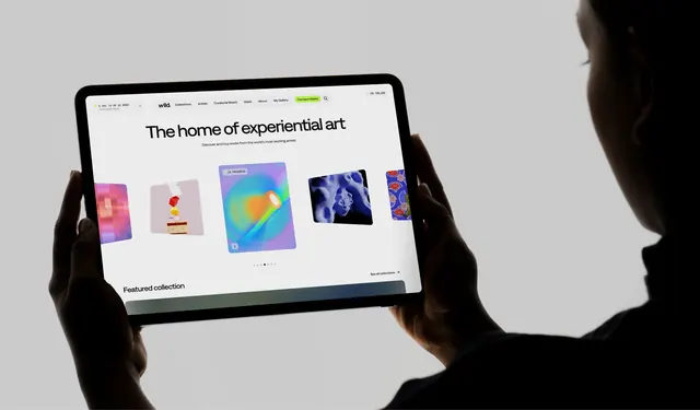
Over-the-shoulder photograph of a tablet held in both hands showing a light, minimal art marketplace homepage with a horizontal carousel of artwork cards.
More like this
See all
Summary
A device-in-hand shot of a pale, editorial marketplace homepage whose hero is one centred line of type over a row of overlapping artwork cards.
Visual description
A person seen from behind holds a large tablet in landscape with both hands against a plain light grey studio backdrop, their shoulder and ear silhouetted dark at the right edge. The screen shows a near-white page. A floating pill navigation sits centred at the top with a lowercase wordmark, six text links, a lime green "Connect Wallet" button and a search icon; a small countdown block reading days, hours and minutes until the next drop sits top left, and a green dot with an online count sits top right. The hero is a single centred line of large tight-tracked sans reading "The home of experiential art" with one small line of grey sub-copy under it. Below sits a horizontal run of five artwork cards at different depths, the centre one largest and carrying a small "IN PROGRESS" chip and an info button, with pixel, still-life, iridescent gradient, blue organic render and patterned pieces visible. Six carousel dots sit beneath, and a "Featured collection" heading with a "See all collections" link begins the next section at the fold.
Key takeaway
The floating pill navigation plus a single centred hero line keeps a marketplace homepage feeling like a gallery wall rather than a storefront, and letting the carousel cards vary in size and depth previews the catalogue's range before a single label is read.
Reuse notes
Reach for this when a light, restrained shell has to host visually loud content: the page contributes almost no colour, so the work supplies all of it. The single accent button is the only saturated element and carries the primary action. Note this is a photographed device rather than a flat capture, so fine UI detail such as body copy is soft and it suits presentation slides more than UI reference.