Preview image. Unlock full-res
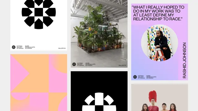
Mosaic of applied brand pieces on light grey, mixing mark panels, gradient shape fields, installation photography and an all-caps artist quote poster.
More like this
See all
Summary
An overview layout that scatters the identity's parts across a loose three column mosaic, so the mark, the colour system, the photography and the quote format are all visible in one frame.
Visual description
Panels of varying proportion sit on a pale grey ground with wide uneven gaps, so the arrangement reads as a spread rather than a strict grid. Top left, a white square carries the black geometric medallion large and slightly above centre, with the bilingual lockup at the bottom left and "GALLERY.CA" at the bottom right. Below it, a landscape panel is filled with a pink to apricot gradient overlaid with oversized flat shapes, a triangle, quarter circles and squares in the opposing colour. The centre column holds a photograph of a gallery installation, a tall metal scaffold packed with potted palms under fluorescent tubes in a white raftered space, carrying the same lockup and URL along its bottom edge, and beneath it a black panel with a white medallion cropped by the frame edge. The right column leads with a portrait poster on a lilac to periwinkle gradient: an all-caps pull quote across four lines reading "WHAT I REALLY HOPED TO DO IN MY WORK WAS TO AT LEAST DEFINE MY RELATIONSHIP TO RACE.", a circular cropped portrait of a man leaning on a paint-spattered stepladder in front of a coloured tile work, the name "RASHID JOHNSON" set vertically up the right edge, and the bilingual lockup at the bottom left. A further photograph of figures dressed in red is cropped by the bottom edge below it.
Key takeaway
Presenting an identity as an uneven mosaic instead of a neat grid lets pieces of very different weight sit together, and cropping some panels at the frame edge implies the system continues beyond what is shown. The constant bilingual lockup in the same corner is the only thing holding the mix in place.
Reuse notes
A good layout for the overview page of a case study or guideline, and for cultural brands that must carry a wide range of artwork. It relies on genuinely good installation and portrait photography; with weak imagery the gaps between panels start to read as emptiness. The gradient quote posters are the most reusable single element here.
More like this

Keep what you find
A free account saves references to boards and can send you a weekly email of picks based on what you save.
To see every result, go Pro.